VRChat Retention, Part 5: From a Survival Model to a Product Decision
VRChat Retention — a Bayesian survival analysis of 267,903 VRChat reviewers on Steam (not all players — see Part 1), built entirely from public data. Headline: churn risk collapses in the first 90 days and then goes flat for three years, and the five engagement segments are on genuinely different clocks.
Part 1 — the estimand · Part 2 — three regimes · Part 3 — when simple models fail · Part 4 — five lifecycles · Part 5 — from model to decision
The short version
The single most useful sentence in the project: churn risk is concentrated in time in the first 90 days and in people in the weakest segments — so that is where a timed intervention has leverage. It is not where most of the loss is. Nearly twice as many people leave after day 90 as before it; that larger loss is spread evenly across three years, so it needs an always-on product mechanism rather than a campaign. Confusing those two is the easiest expensive mistake to make with this data, and Part 2 spells it out.
The base, in one line. Those 267,903 reviewers carry roughly 702,000 user-years of expected retained time over five years. 18.5% of them — 49,591 people — are gone inside 90 days, counting the 8.5% who had already stopped before they wrote their review. After that the rate flattens to about 1.5% a month and stays there for three years.
(Retained time means days on the roster before operational churn, not hours played. It is the denominator you would multiply a revenue rate against, not revenue itself. The 702,000 figure is the model’s net expected days summed over segments; two independent non-parametric routes give about 704,000 and 697,000, so it is good to roughly ±0.7%.)
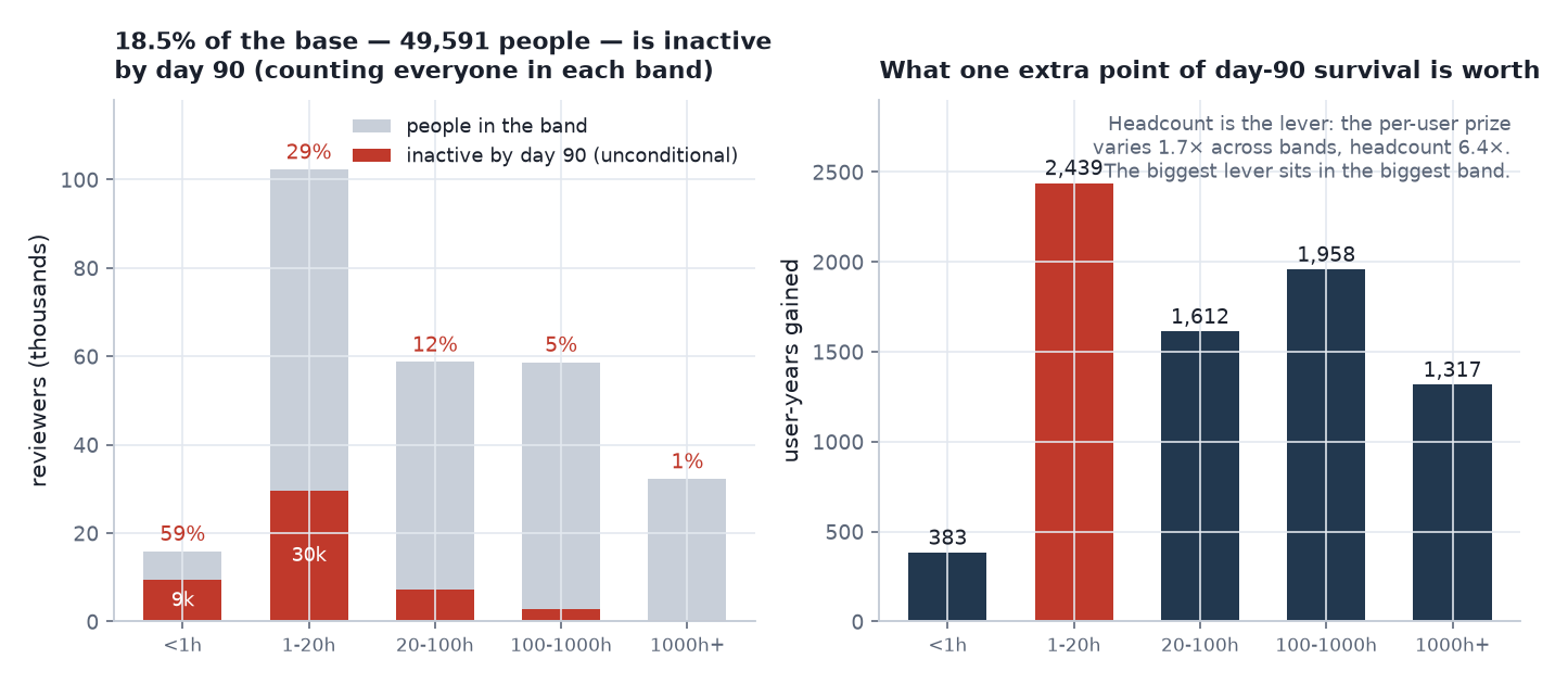 Left: how much of each band is inactive by day 90, counting everyone in the band. Right: the user-years bought by raising day-90 survival one percentage point. The per-user prize varies only 1.7× across bands while headcount varies 6.4×, so headcount is the lever — which puts the biggest one in the 1–20h band.
The nine things I would put in front of a product leadership team
| # | Finding | Confidence | What I would do about it |
|---|---|---|---|
| 1 | Risk is front-loaded in rate: a 212× collapse over 90 days, then a plateau varying by only 1.16× for three years. But 18.5% of the base is lost in those 90 days against 35.4% over the three years that follow | High. Measured non-parametrically before any model; survives every sensitivity | Put timed interventions in the first 90 days, where there is a spike to aim at. Treat the later loss as a continuous problem — an always-on product mechanism, not a campaign with a start date |
| 2 | A third of everything the weakest segment will ever lose, it loses in the first 90 days. For the strongest it is 2.5% | High | Set segment-specific review windows: days 7 / 30 / 90 for the light bands, annual for the heavy ones. One shared “day-30 retention” KPI hides both stories |
| 3 | Value tracks headcount almost exactly. The heaviest band is only 1.63× over-represented, against a structural ceiling of 1.91× at a five-year horizon | Medium-high. Depends on which average you take — the error in §1 | Do not build a whale strategy on this. It is the finding that makes row 4 work: since value per user barely varies, the prize follows the headcount. Also: average a band over everyone in it, not just the still-active — that inflates the weakest band by 72% |
| 4 | The largest addressable prize is the 1–20h band — roughly 7,700 user-years for a 10% conversion, against ~5,000 at the top of the ladder | Medium. An observational upper bound, not a treatment effect | Run the first onboarding experiment there. The per-user prize is roughly flat across bands, so band size is the whole story, and 1–20h holds 102,299 people |
| 5 | +1 percentage point of day-90 survival in the two weakest bands is worth about 2,800 user-years — 1% × 118,202 people × ~870 expected remaining days over the rest of the five-year horizon, ÷ 365 | Medium | Use it as the unit of account for any onboarding experiment, so cost and benefit are in the same currency before anything gets built. The per-band arithmetic is in the figure above |
| 6 | Expected remaining life rises with tenure for weak users (+28.8% by day 90) and is flat for strong ones (+0.1%) | High | An LTV model that depreciates new users as they age has the sign backwards. For established users, age is close to irrelevant |
| 7 | Among the five signals Steam exposes, playtime at review swamps the rest: ×2.11 per standard deviation against ×1.30 for the next-largest (games owned) | High, but narrow in scope | This is a statement about Steam’s metadata, not about features in general. First-party behavioural signals — first-week friend adds, populated-instance entries, session length — are untested here and are where I would look next. Note the asymmetry: recommending the game barely predicts staying (×1.10) but strongly predicts having already left (odds ratio 0.57) |
| 8 | 8.5% of reviews are written by people who had already stopped playing, and they are 1.89× as likely to be negative (2.36× within playtime band). They are 8.5% of reviewers and 14.9% of negative reviews | High | Split review sentiment by whether the reviewer was still active. A falling score may be a lagging churn signal rather than a satisfaction signal — see Part 1 |
| 9 | Steam sees only about half the platform, so an unknown share of “churn” is migration to standalone hardware | Low on magnitude, high on direction | The segment ordering survives every false-churn scenario I can construct; the 3.9× spread does not (2.3×–4.0×). This is fixed by first-party instrumentation, not by more modelling |
The evidence for each is below. Sections 1–3 are what the numbers say; §4 is why the model should be believed, including the two places it fails; §5–§6 are the two limits I would raise before anyone acts on this. Along the way there is one error in my own work that changed a headline number by 72% and reversed the recommendation in row 4.
1. What a user is worth — and the error in my own table
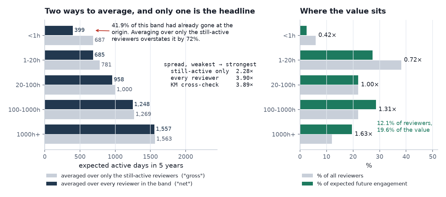
Left: expected active days averaged two ways — over every reviewer in the band, and over only those still playing when they reviewed. Right: share of reviewers against share of expected retained time.
Here is a mistake that survived the first write-up and was caught by the audit.
The value table mixed two definitions without saying so. In plain language:
- Per still-active reviewer (the gross figure) — the average over only the people who had not already stopped playing when they wrote their review.
- Per reviewer in the band (the net figure) — the average over everyone, including the 8.5% who had already gone and therefore contribute zero days.
I published the first under a heading that reads as the second, while computing the “% of value” column from the second. Read plainly: averaged over every reviewer in the weakest band, a user is worth 399 days; averaged over only the ones still playing when they reviewed, 687. The first is the one to quote, because 41.9% of that band had already gone.
(These are the model’s figures. Part 2’s non-parametric table — 401 / 686 / 961 / 1,252 / 1,561 — is the same quantity measured without a model, and the two agree to within 0.5%. Quote either, but not both in one document.)
| Segment | published (gross) | correct (net) | overstatement |
|---|---|---|---|
| under 1h | 687 | 399 | +72.1% |
| 1–20h | 781 | 685 | +14.1% |
| 20–100h | 1,000 | 958 | +4.3% |
| 100–1000h | 1,269 | 1,248 | +1.6% |
| 1000h+ | 1,563 | 1,557 | +0.4% |
The distortion is largest exactly where it matters most, because 41.9% of the weakest segment had already gone. And it compresses the headline:
| Spread, weakest → strongest | |
|---|---|
| published (gross) | 2.28× |
| correct (net) | 3.90× |
| non-parametric Kaplan–Meier check | 3.90× |
One caveat to carry with that 3.90× wherever it is quoted: §6 shows it moving between 2.3× and 4.0× once Steam-only false churn is allowed for. The ordering holds in every scenario; the magnitude is an assumption-dependent number, not a measured one.
The non-parametric benchmark from Part 2 — 401 to 1,561 days — matches NET, which is what identifies NET as the figure comparable to the raw data. Two sections of the project were quoting different numbers for the same thing, and a cross-check that had been sitting there all along resolved it.
The correction strengthens the business case, and it points somewhere unexpected. Value is more concentrated than the published figures showed — but the striking thing is how little concentration there is in absolute terms:
| Segment | % of users | % of expected future engagement | concentration |
|---|---|---|---|
| under 1h | 5.9% | 2.5% | 0.42× |
| 1–20h | 38.2% | 27.3% | 0.72× |
| 20–100h | 21.9% | 22.0% | 1.00× |
| 100–1000h | 21.9% | 28.6% | 1.31× |
| 1000h+ | 12.1% | 19.6% | 1.63× |
That 1.63× is worth pausing on. Expected days are capped at the 1,825-day horizon against a population mean of 956, so no band can exceed 1.91× by construction — the heaviest band is at 85% of the structural maximum, and the concentration curve is close to flat. “Value is concentrated” invites a Pareto reading this data does not support: value tracks headcount almost exactly. That is a more useful finding than a whale story, because it is precisely why §3’s biggest prize turns out to sit in the biggest band rather than the richest one.
2. Where the risk actually lives
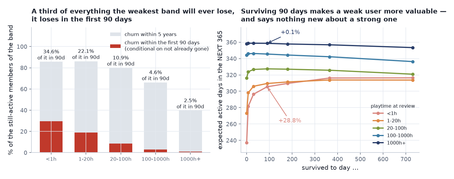 Left: how much of each band’s five-year churn happens in the first 90 days — both bars are conditional on not having already left at the origin, so numerator and denominator match. Right: expected active days in the next 365, given survival to a point.
| Segment | churn by day 90, conditional | churn by day 90, unconditional | churn by 5 years | share of 5-yr churn in the first 90 days |
|---|---|---|---|---|
| under 1h | 29.6% | 59.1% | 85.7% | 34.6% |
| 1–20h | 19.0% | 29.0% | 86.2% | 22.1% |
| 20–100h | 8.7% | 12.5% | 79.9% | 10.9% |
| 100–1000h | 3.1% | 4.6% | 66.2% | 4.6% |
| 1000h+ | 1.0% | 1.4% | 39.6% | 2.5% |
Columns 1, 3 and 4 are conditional — among people who had not already left at the origin. Column 2 is unconditional: it includes them, and it is the one to quote for “what fraction of this band is gone by day 90”. The final column keeps numerator and denominator on the same conditional basis, which is why it is not mixed.
A third of everything the weakest segment will ever lose, it loses in the first 90 days. For the strongest segment it is 2.5%.
Read that against Part 2’s plateau: after roughly day 90 the hazard is flat for three years. Post-90 churn is not a danger window — it is a constant background rate, and a campaign timed at it buys the same outcome whenever it runs. Timed retention effort therefore belongs on new and low-playtime users and should be judged on a 90-day window. That is not the same as saying the later loss is small: in headcount it is nearly twice as large, and reducing it is a product-structure problem rather than a campaign problem.
Surviving makes you more valuable — but only if you were fragile
A second correction from the audit
The original “expected remaining life” table integrated to a horizon fixed at 1,825 days from the origin, so the window shrank as tenure grew: 1,825 days of runway at day 0, but only 1,095 at day 730. Later tenures were being scored over a shorter span, which manufactured an apparent decline in value after day 90.
Re-derived on a fixed 365-day forward window, so every row is measured over the same span:
Survived to under 1h 1–20h 20–100h 100–1000h 1000h+ day 0 237 273 316 344 358 day 90 306 310 327 346 359 day 365 316 314 326 342 357
Segment day 0 → day 90 under 1h +28.8% 1–20h +13.3% 20–100h +3.6% 100–1000h +0.3% 1000h+ +0.1% The rise is real and survives the correction. The decline was largely the window closing, not users losing value.
The corrected version is also a sharper statement than the original. The effect is almost entirely confined to the weak segments: heavy users were never at meaningful risk, so surviving 90 days tells you nothing new about them. “Users become more valuable with tenure” is true — for newcomers.
Which has a direct consequence: an LTV model that depreciates new users as they age has the sign backwards. For established users, age is close to irrelevant.
3. The line this analysis will not cross
The most valuable-looking table in the project is the one that sizes onboarding — and it is where the per-reviewer correction of §1 does the most damage.
| Move | Extra expected days, gross | Extra expected days, net | 95% CrI (net) |
|---|---|---|---|
| under 1h → 1–20h | +94 | +286 | [277, 295] |
| 1–20h → 20–100h | +218 | +274 | [267, 280] |
| 20–100h → 100–1000h | +269 | +290 | [283, 297] |
| 100–1000h → 1000h+ | +295 | +308 | [301, 316] |
The published version of this table was built by differencing the still-active column. On the corrected net basis the picture changes in a way that matters:
- The steps are roughly flat — 274 to 308 days — not a ramp from 94 to 295. The gross version understated the bottom rung by a factor of three, because it silently excluded the 41.9% of that band who had already gone.
- So the per-user value of moving someone up a band is close to constant across the ladder, which means the size of the prize is driven by how many people are in the band, not by which rung they sit on.
That reverses the recommendation. Sizing a 10% conversion at each rung:
| Move | People in the lower band | 10% converted, at the net step |
|---|---|---|
| under 1h → 1–20h | 15,903 | 1,245 user-years |
| 1–20h → 20–100h | 102,299 | 7,667 user-years |
| 20–100h → 100–1000h | 58,730 | 4,665 user-years |
| 100–1000h → 1000h+ | 58,686 | 4,959 user-years |
The published conclusion was that the largest prize sits at the top of the ladder — 100–1000h → 1000h+, 4,738 user-years. That was wrong for two independent reasons, and it is worth separating them because only one is the correction above.
The objective was wrong. The code picked the band with the largest per-user step and only then multiplied by that band’s headcount. It never maximised headcount × step across bands. Doing that correctly on the original gross numbers already picks 1–20h → 20–100h at 6,121 user-years, against 4,738 at the top rung. So the gross/net correction did not flip the band — a coding error did, and the flip was available before any of this.
The basis was also wrong. Moving to the correct per-reviewer figures then changes the winning band’s magnitude from 6,121 to 7,667 user-years, and compresses the ladder from a 94→295 ramp to a roughly flat 274→308.
Both matter, and conflating them would have credited the statistical correction with a fix that belonged to a max() on the wrong key. That also resolves a tension the original created: §2 says the addressable risk is early and in the weak segments, while the published onboarding table pointed at the strongest segment. Corrected on both counts, the two agree.
Every one of these numbers is still an observational gap, not a treatment effect. The framing that survives is:
An intervention cannot be worth more than the observed gap. If 7,700 user-years does not justify the engineering cost, the idea can be dropped now, without further work. If it does, the next step is an experiment, not more observational modelling.
One caveat specific to the net figures: part of the net gap between adjacent bands comes from a lower probability of having already gone at the origin — 41.9% in the weakest band against 12.4% in the next. An intervention can only capture that part if it reaches people before they stop, which is a harder product problem than retaining someone who is still active. The net step is an upper bound in that sense too.
4. Does the model deserve to be believed?
Everything above rests on a 91-parameter Bayesian model, so this is where I show why it should be trusted — and the two places it should not.
Convergence is necessary and nowhere near sufficient. R̂ and ESS answer did the sampler explore the posterior of the model I wrote? — not is this the right model? A perfectly converged model can be systematically wrong. So the project checks four separate things.
Does it reproduce the data? M5’s within-segment survival tracks the Kaplan–Meier curve to a mean absolute error of 0.10 pp across 45 segment-horizon cells, worst case 1.1 pp at day 1,825 in the heaviest segment. M3’s pooled fit is 0.22 pp on a daily grid (see Part 3 — the 0.03 pp I originally published was measured only at the model’s own knots).
A check I have to withdraw. Earlier versions of this project cited
(1 − π₀) × S₍t>0₎(t)reproducing the all-users curve to 0.03 pp as “the empirical licence for the two-part split”. It is not evidence of anything. When every zero-duration record is an event at t = 0, that relationship is an algebraic identity — I checked it at twelve horizons and the ratio is constant to 5e-14. It only re-tests whether M3 fits thet > 0curve, which a near-saturated 18-parameter model does by construction. The two-part structure is justified by the shape of the data (a continuous density cannot put mass on a point) and by the fact that the atom behaves differently, not by that identity.
Does the complexity generalise? PSIS-LOO on a fixed 25,000-person subsample, identical across every model. The paired comparison against its nearest rival is 2,493 ± 66 — 38 standard errors. Bayesian stacking, run on the same pointwise log-likelihoods, gives M5 weight 0.948: a second summary of the same evidence, not a second source of it.
Are the intervals honest? Partly. Part 4 showed M5’s population-RMST interval failing to cover the non-parametric value. I report that rather than only the tests it passes.
Do the priors matter?
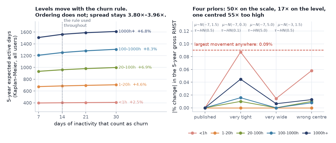 Left: the 5-year expected-days table (Kaplan–Meier, all users) re-estimated under four definitions of churn. Right: the 5-year gross RMST per segment re-estimated under four priors.
The model was refit under four priors — a 50× span on the hierarchical scale and 17× on the level — including one deliberately centred on a hazard 55× too high. The largest movement in any published number was 0.09%. (The saved table is rounded to a tenth of a day, so 0.09% is as precise as it can honestly be stated; at full precision it is 0.092%.)
That converts “the prior is defensible” into “the prior does not matter”, and only the second is testable. But I should be honest about what it proves: almost nothing. At n = 245,102 with 748 events in the thinnest interval, no prior on a location or scale parameter could have moved this posterior. I make exactly that argument in Part 3 to dismiss the random-walk smoothing prior, so presenting the same foregone conclusion here as evidence would be having it both ways. It is a null result I expected.
The sensitivity that could actually have failed is the interval grid. Every result in this series rests on 18 hand-chosen cut points, placed where Part 2 said the hazard was moving. If the answers depend on that choice, nothing else matters. Refitting on four grids — the published one, a coarser 9-interval grid, a 35-interval grid with midpoints added, and a 19-interval log-spaced grid deliberately not aligned with Part 2’s descriptive bands:
| Grid | Intervals | Plateau variation | S(90), lightest band | 5-year net days, lightest → heaviest | Spread |
|---|---|---|---|---|---|
| published | 18 | 1.08× | 70.3% | 399 → 1,558 | 3.91× |
| coarse | 9 | 1.03× | 70.2% | 397 → 1,548 | 3.90× |
| fine | 35 | 1.12× | 70.3% | 399 → 1,559 | 3.91× |
| log-spaced, unaligned | 19 | 1.08× | 70.3% | 398 → 1,549 | 3.89× |
Survival at day 90 is identical to a tenth of a point across all four; the segment spread moves by 0.5%; the plateau is flat on every grid. That one could have gone the other way, and it did not.
The churn rule gets the same treatment. At 7, 14, 21 and 30 days of inactivity the levels move by up to 8.3% — as they must, since a 7-day rule labels more people churned. The ordering of segments and the direction of every conclusion are unchanged across the whole range, and the top-to-bottom spread stays between 3.80× and 3.96×. The decisions rest on the ordering, so they survive; absolute figures should always be quoted with the rule attached (“median 962 days on a 14-day inactivity rule”).
The audit, in numbers. 97 automated checks, all of which I re-ran while writing this series. 30/30 likelihood checks: eight are direct comparisons against SciPy, at ordinary values and deep in the censored tail, agreeing to machine epsilon; the rest are internal identities, of which the loosest is a numerical-quadrature check agreeing to 2.8e−5. 30/30 estimator checks against independent implementations — Kaplan–Meier against
lifelinesto 1e-13, RMST to 1e-14. 37/37 published-number checks against the saved posteriors. The project also records a clean 14-step re-run from an empty output directory producing byte-identical tables, because the MCMC is seeded; I did not re-execute that for this write-up, so I am reporting it rather than confirming it.And none of those 97 checks found any of the errors reported in this series. Automated checks catch arithmetic. They do not catch a quantity being defined two ways in two sections, or a fit statistic scored against the wrong population. That is what the manual audit is for, and it is why reproducibility is not the same thing as correctness.
5. One coefficient that is genuinely not identified
46% of Steam profiles are private, so games_owned is missing for nearly half the sample. Two defensible treatments give two different answers:
| Treatment | multiplier |
|---|---|
| median imputation (published) | ×1.30 |
| complete cases only | ×1.44 |
An 11% span, and no basis in this data for preferring one end. The honest statement is not a point estimate; it is that this coefficient is not pinned down better than about ±5% around its midpoint, and every version of it should be read that way.
A third treatment — Bayesian multiple imputation — returns ×1.20, and I am not offering it as a third estimate, because the project’s own script says why not. Its imputation model is unconditional (log_games ~ Normal(μ, σ), ignoring the other covariates and the outcome), which violates a standard requirement of multiple imputation and biases the pooled coefficient toward the null — exactly the direction observed. What that run does produce, and what is worth keeping, is the variance decomposition: 43.6% of the coefficient’s posterior variance comes from the missingness itself, against 0.6% for playtime.
Even a correctly specified imputation would close only the statistical gap and leave the identification gap wide open: multiple imputation assumes missing at random, and people who hide their Steam profile are almost certainly not a random subset. Public data provides no way to test that, and saying so is more useful than picking whichever number reads best.
Two more known issues, uncorrected because they are immaterial: 115 people (0.043%) sit in the under-1h segment because their playtime was unknown rather than low — imputation being read as data. And a piecewise-exponential with playtime as a proportional covariate on a shared baseline was never fitted. That model would separate two things M5 currently confounds: that playtime carries information at all, and that its effect changes shape over time. Part 2’s non-parametric 34× decay in the hazard ratio is strong indirect evidence for the second, but it is indirect, and I would rather say so.
6. The threat I actually worry about, and a scenario sweep on it
The priors move the published numbers by 0.09%. The churn rule moves the levels by 8%. Neither is the thing that could break this analysis.
The thing that could break it is that churn here is Steam-only. A user who buys a standalone Quest and never opens Steam again is recorded as churned while still playing. That is false churn, it is almost certainly not evenly spread across segments, and no amount of prior sensitivity touches it.
One thing I should not do is pretend to have measured it. Steam accounts for about 51.9% of VRChat’s concurrent users (median across 31,936 hourly observations since 2023), and it is tempting to read that as a bound. It is not. That statistic describes the platform mix of the whole player base, most of which never used the Steam build at all. The quantity I need is the rate at which Steam reviewers — people who by construction owned and used the Steam build — later abandon Steam for standalone hardware. That is unmeasured, and nothing in public data measures it.
So this is a scenario sweep, not a bound. Suppose some fraction of each segment’s observed churn events are really migrations off Steam, and re-label that fraction as censored:
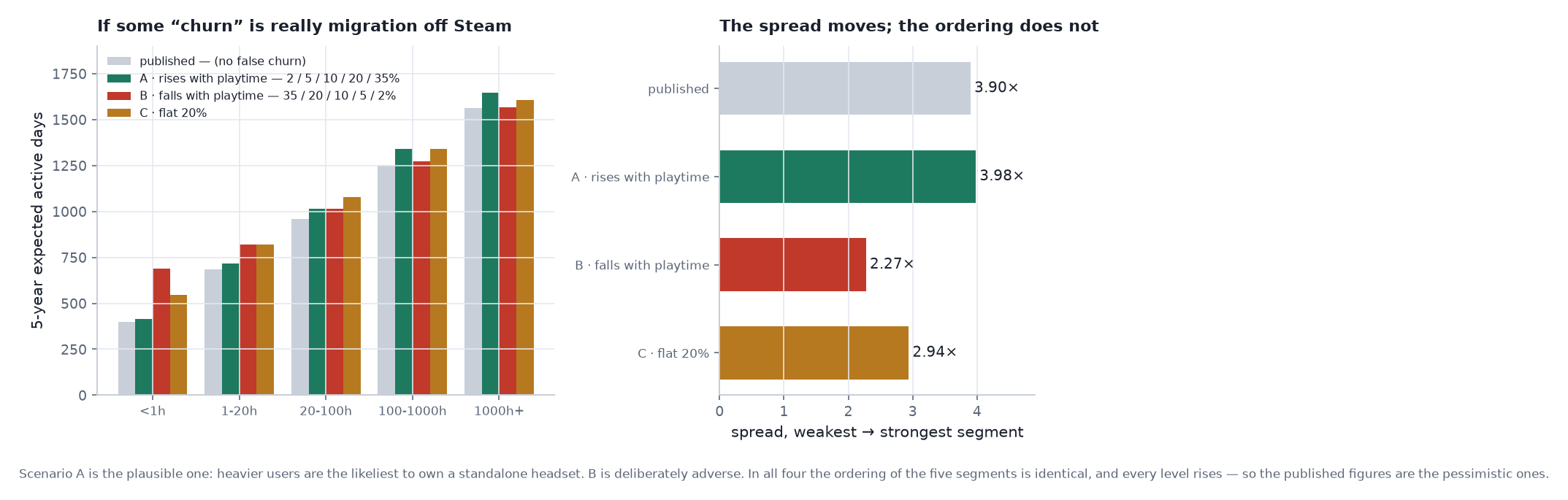 Scenario A is the plausible one — heavier users are the likeliest to own a standalone headset. B is deliberately adverse to the finding. C is a flat 20%.
| Scenario | under 1h | 1000h+ | spread |
|---|---|---|---|
| published (no false churn) | 401 | 1,561 | 3.90× |
| A · rises with playtime (2/5/10/20/35%) | 414 | 1,646 | 3.98× |
| B · falls with playtime (35/20/10/5/2%) | 689 | 1,566 | 2.27× |
| C · flat 20% | 548 | 1,609 | 2.94× |
Two things come out of this, and only one of them is comfortable.
The ordering never changes. In all four scenarios the five segments rank identically, and every level rises. The published figures are therefore the pessimistic ones, and every recommendation in this post rests on the ordering rather than on the levels — which is why they survive.
The magnitude is genuinely uncertain. The spread runs from 2.3× to 4.0× depending on an assumption I cannot test. So “3.9×” should be read as “3.9× under the assumption that observed inactivity means inactivity”, not as a measured quantity. Scenario B is the implausible direction — it requires light users to be more likely to have migrated to standalone hardware — and even it leaves a 2.3× gap.
This is the largest threat to validity in the series. It is not bounded, only swept — and it is the one first-party data would eliminate outright.
7. Three metrics, and the winner changes — plus the rule that follows
| Metric | Winner | What it is asking |
|---|---|---|
| PSIS-LOO elpd | M5 | which model predicts individual event times best |
| population-average RMST | M3 (−2 d vs +8 d) | which model gets the marginal number closest |
| S(90), population | M3 (−0.024 pp vs −0.033 pp) | which model gets the 90-day survival closest |
| segment-level RMST | M5, by 26× over M4 | which model gets the published numbers closest |
M3 wins two of the four. All four measurements are correct; they disagree because they ask different questions, and publishing any one alone would have justified a different model choice. The honest headline is not that M5 sweeps — it is that M5 is chosen for the segment-level numbers and pays for it on every marginal quantity, which is exactly the trade the project made on purpose. (The project’s own log calls this “three metrics, three winners”. Across those three there are two distinct winners, which is one fewer than advertised.)
The rule this project follows: score the model on the quantity you will actually use. elpd picked the right model here, but partly by luck — the population-RMST comparison would have picked the wrong one, and it is the more natural thing to reach for.
8. What I would do next, in order
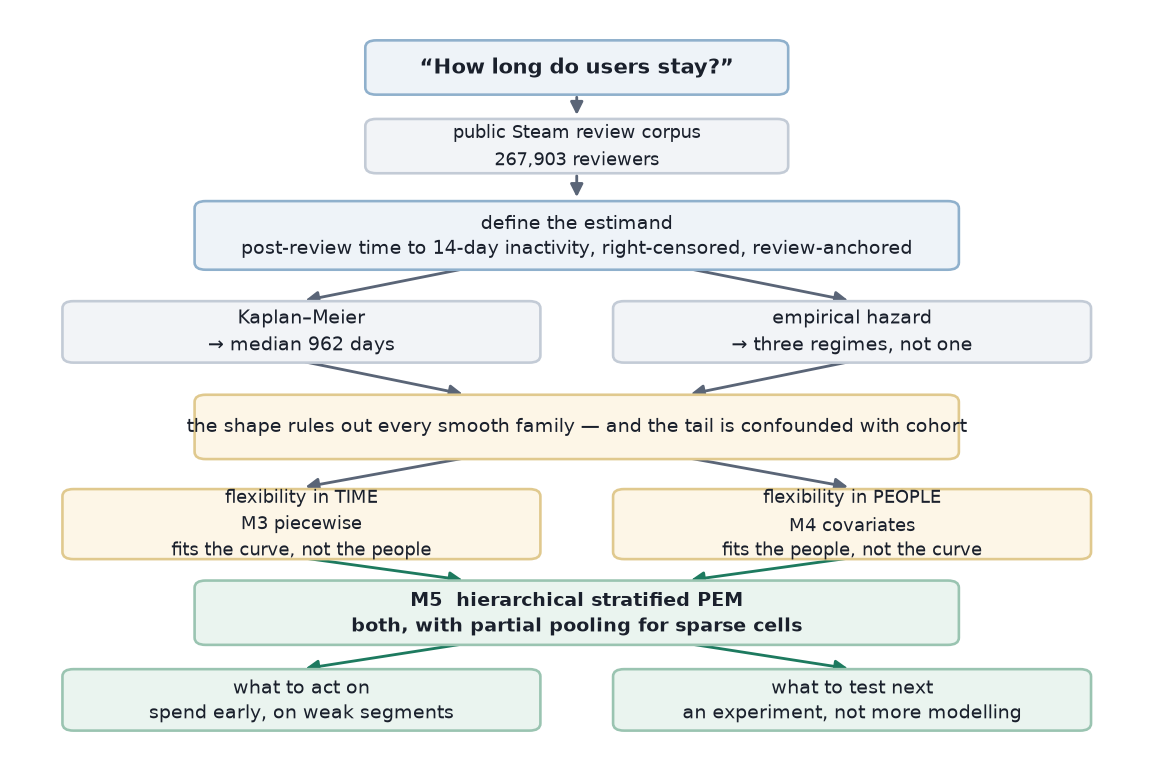 How the argument got here, and the two things that follow from it. Everything above the green row is done; the green row is what this post argues for next.
1. Run the experiment this model sized. Randomise an early-engagement intervention among low-playtime users; the outcome stays survival-based (time to operational churn), so the analysis machinery transfers directly. That converts an upper bound into a treatment effect.
Two bridges have to be built before that number is decision-ready, and neither is statistical. First, units. User-years are not money. Multiply by your own revenue per active day: at a nominal $0.05 per active day, 7,700 user-years is about $140,000 — the figure to hold against engineering cost. I use a made-up rate deliberately, because the point is the mechanics, and the real rate is something only VRChat has. Second, addressability. The 102,299 people in the 1–20h band are reviewers, identified by playtime at the moment they wrote a review. To run the experiment you need to identify the equivalent users prospectively, from first-party telemetry, without waiting for them to write anything. That is an instrumentation task, and it is the same one that fixes the Steam-only blind spot.
2. Validate out of time, not just out of sample. PSIS-LOO here is a random hold-out, which assumes cohorts are exchangeable — the assumption Part 2 shows to be false when it kills the year-3 hazard rise. It tells you the model predicts a held-out 2019 reviewer from other 2019 reviewers. It does not tell you it predicts 2026 reviewers from pre-2024 ones, which is the only prediction a retention team ever actually needs. Fitting on pre-2024 reviews and scoring S(90) on the 2024–2026 cohorts would answer that; the censoring gradient keeps the honest horizons short, but S(90) is exactly the horizon the recommendation rests on.
3. Move the clock to first meaningful activity. Every limitation in Part 1 traces back to the origin being a self-selected review. With first-party data the clock starts at signup, the sample stops being reviewers, and the estimand becomes account lifetime rather than a proxy for it.
4. Attach a value rate. Expected active days is not money. With a revenue rate r(t), expected value over a horizon is ∫ S(t) r(t) dt — the survival machinery is already the hard half of that integral. The dataset here simply has no revenue in it, so the project stops one step short and says so.
5. Fix the platform blind spot. §6 bounds it; only first-party data eliminates it. Everything in this series would be sharper if “active” meant active on the platform rather than active on Steam.
9. What this actually establishes
| Supported | Not supported |
|---|---|
| Post-review retention has three regimes; risk is front-loaded | That this is account lifetime |
| Segments follow different lifecycles, not one scaled curve | That the differences are caused by playtime |
| Addressable risk is concentrated in the first 90 days | That post-90 campaigns can move the flat rate |
| Value is concentrated: 12.1% of users, 19.6% of engagement | That engagement equals revenue |
| The ordering of segments is robust to the churn rule, the priors and every false-churn scenario | That the year-3+ hazard rise is behavioural |
| That the 3.9× spread is a measured magnitude — it is 2.3×–4.0× depending on false churn |
10. What I would take away from this
The final model is a hierarchical Bayesian survival model with 91 sampled parameters generating 90 hazard cells, and it is the least interesting thing in this series.
What decided the outcome happened earlier, and mostly in plain language: what the unit of analysis is, when the clock starts, what counts as an event, which observations are censored and why, which features existed at the prediction time, who the sample actually represents, and which apparent findings are artefacts of how the data was collected.
The models are just the formalisation of those answers. Each rung on the ladder exists because the data rejected the assumption below it — never because a more complicated model would look better in a write-up. And several numbers in this series are different from the ones I first published, because I went back and checked my own work hard enough to find out they were wrong: the per-segment value table (gross quoted as if unconditional, +72% on the weakest segment), the expected-remaining-life table (a shrinking integration window that manufactured a decline), and the goodness-of-fit statistics for Models 1 and 2 (scored against the wrong population). Two convergence diagnoses were also wrong, and both were float32.
For a retention problem, I would rather hand a team a model that says here is what the evidence supports, here is where uncertainty remains, and here is the experiment I would run next than one that says here is the prediction.
Full series: Part 1 — the estimand · Part 2 — what the data said · Part 3 — when simple models fail · Part 4 — beyond the average user · Part 5
Fit in NumPyro (Python 3.12 / JAX) in float64, 4 chains, seeded for bit-level reproducibility. Sampler settings vary by model: 1,000 warmup / 1,000 draws at target_accept 0.90 for M1, M2 and M4; 3,000/3,000 at 0.95 for M3; 6,000/8,000 at 0.99 for M5. Data: public Steam review corpus for app 438100, 267,903 reviewers, collected 2026-08-28. No user identifiers and no review text are reproduced anywhere in this series.