VRChat Retention, Part 2: Churn Risk Has Three Regimes, and Only One Is Addressable
VRChat Retention — a Bayesian survival analysis of 267,903 VRChat reviewers on Steam (not all players — see Part 1), built entirely from public data. Headline: churn risk collapses in the first 90 days and then goes flat for three years, and the five engagement segments are on genuinely different clocks.
Part 1 — the estimand · Part 2 — three regimes · Part 3 — when simple models fail · Part 4 — five lifecycles · Part 5 — from model to decision
The short version
Churn risk is concentrated in time, not in headcount, and the difference decides what you build. In the first 90 days people leave about six times faster per day than they do afterwards — that is where a timed intervention has something to aim at. But because the flat stretch is so long, more people are actually lost after day 90 than before it: 18.5% of the base is gone by day 90, and another 35.4% goes between day 90 and year three. That larger loss has no window in it, so it needs an always-on mechanism rather than a campaign. Both halves of that sentence are visible in the data before any model is fitted.
In technical terms: churn risk is not one thing that decays. It has three regimes — a spike at the origin, a collapse over the first 90 days, then a plateau from month three to year three so flat it varies by a factor of 1.16. Before choosing a model I asked the data four questions, and the answers eliminated most of the standard survival toolkit in a single figure rather than in a fit statistic.
The second finding is the one I would rather have kept: the hazard rises again after year three, which looks like “long-tenured users start leaving”. It is not. It is who is left in the sample, and §3 is the work of killing it.
1. Start with the curve the data supports
The first estimate is deliberately non-parametric. Kaplan–Meier uses each censored person’s information up to the moment they stop being observable, then removes them from the risk set — no distributional assumption, no shape imposed.
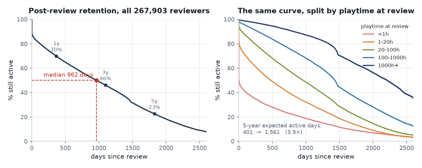 Left: post-review retention for all 267,903 reviewers. Right: the same estimator applied within playtime segments. Both are non-parametric — nothing has been assumed about shape.
| Horizon | Still active | People still at risk |
|---|---|---|
| 1 year | 69.8% | 175,013 |
| 3 years | 46.1% | 102,542 |
| 5 years | 22.6% | 34,132 |
| 7 years | 8.4% | 6,845 |
Median post-review retention is 962 days. That estimate is hand-rolled in this project, so it is checked against lifelines — the two agree to within 1e-13 at every horizon, and the medians match exactly (961.54 days, zero relative error).
This is the reference curve. Every model in Part 3 is judged against it.
2. Survival tells you where people are. Hazard tells you what is happening to them
The survival curve answers how many are left. That is not the question a retention team needs. They need how risky is right now, for the people who are still here. That is the hazard: the probability of leaving in the next instant, given you have survived to this one.
Two populations can share a survival value at some horizon and have completely different hazards underneath — one front-loaded, one back-loaded — and the intervention you would design for each is different. So I went straight to the hazard.
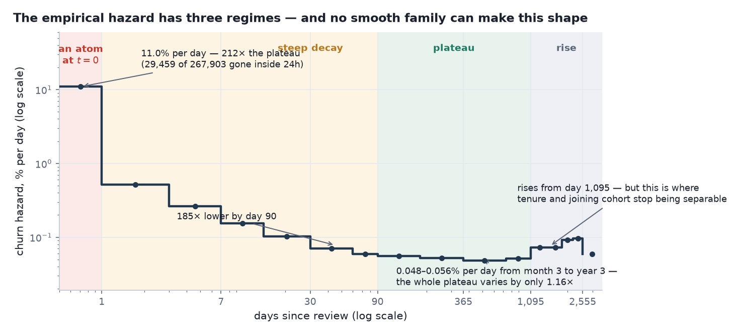
Discrete hazard per day, on log–log axes. Shading marks the three regimes plus the confounded tail.
Regime 1 — an atom at the origin. 29,459 of 267,903 people are gone inside 24 hours: a hazard of 11.0% per day. 22,800 of those had already stopped before writing their review (Part 1); the remaining 6,659 played again within 24 hours and never again.
Regime 2 — collapse. From day 1 to day 90 the hazard falls from 0.52%/day to 0.060%/day — 185× below the day-zero rate. Against the plateau that follows, the day-zero hazard is 212× higher.
Regime 3 — a plateau you could set a watch by. Between day 90 and day 1,095 the hazard sits between 0.048% and 0.056% per day — about 1.5% a month. Across that whole span, month three to year three, it varies by a factor of 1.16.
Between three months and three years, churn risk stops depending on tenure. It becomes a constant background rate of about 1.5% a month — knowing how long someone has been around tells you nothing more about their risk.
What “flat” does and does not mean
This is the easiest place in the whole analysis to draw the wrong conclusion, and the wrong conclusion is expensive, so it is worth being explicit.
Flat means the risk is not time-localised. It does not mean the risk is small. Run the numbers on the survival curve above:
| Period | Share of the base lost | People | Rate |
|---|---|---|---|
| first 90 days | 18.5 pp | ~49,500 | 0.205 pp/day |
| day 90 → year 3 | 35.4 pp | ~94,900 | 0.035 pp/day |
So nearly twice as many people leave after day 90 as before it — the daily rate is just 5.8× lower, spread over 1,005 days instead of 90.
The operational consequence is not “ignore late-tenure users”. It is that the two losses need different instruments:
- The first 90 days has a spike you can time. A day-7 or day-30 intervention lands on a real concentration of risk, and its effect is measurable against a short window.
- After day 90 there is no window to aim at. The same total budget spent as a timed campaign is spread across a uniform hazard, so it buys the same outcome whenever you spend it. Reducing that loss means an always-on mechanism — something structural about the product — not a campaign with a start date.
Everywhere this series says “the addressable risk is early”, it means addressable by a timed intervention. It never means the later loss is small; it is the larger of the two.
And it is the shape, not the level, that forecloses the modelling options:
A hazard that falls 212-fold and then goes flat cannot be produced by any monotone parametric family. Not exponential, not Weibull, not Gompertz. This is settled before a single model is fitted.
3. The finding that wasn’t
From day 1,095 the hazard climbs again — 0.073%/day in years 3–5, 0.091–0.097%/day in years 5–7, roughly 1.4× and 1.8× the plateau.
The natural story writes itself: long-tenured users become more likely to leave. It would have been a good slide.
It is not supportable, and the reason is the observation process rather than the behaviour.
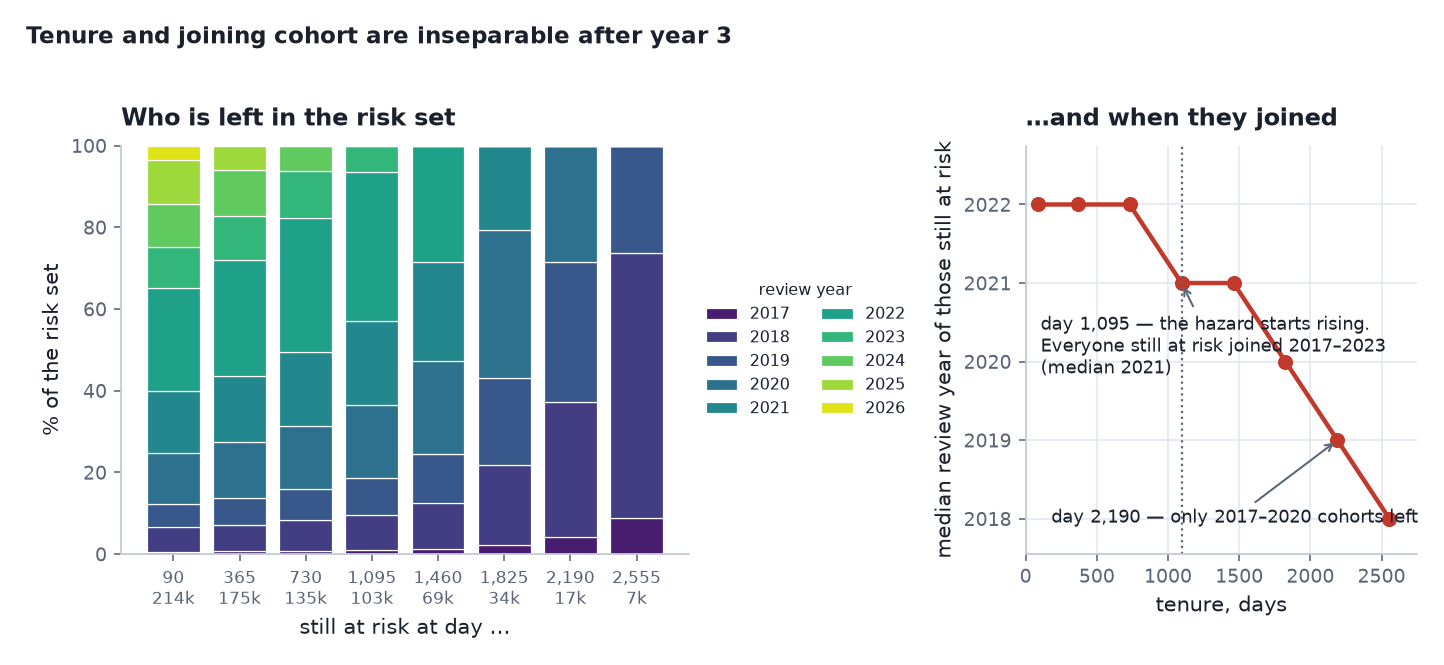 Left: which review-year cohorts make up the risk set at each tenure. Right: the median review year of the people still at risk.
To be at risk on day 1,095 you must have written your review at least three years before collection. Everyone still at risk there joined between 2017 and 2023, median 2021. By day 2,190 only the 2017–2020 cohorts remain, median 2019.
So the late bands are increasingly a sample of old cohorts, not a measurement of what happens to users as they age. Tenure and joining cohort are not separable in this design, and the rise after year 3 cannot be distinguished from “the 2017–2020 intake behaved differently”. Separating them needs an age–period–cohort model, which this dataset cannot identify without assumptions the data cannot supply.
I report the rise, and I report that it is not interpretable as a behavioural effect. That is the honest end of that thread.
A survival analysis is an analysis of a behavioural process and of an observation process, and an interesting curve is not automatically an interesting product fact. The question worth asking of every feature is whether the way the data was collected could have produced it.
4. Is there a cure fraction? No — and it is worth showing why
Mixture-cure models are the natural reach when you believe some fraction of users never churn. They are only identifiable if the survival curve flattens while people are still at risk. Here it does not: it falls to 0.6% with a single person still at risk.
Fit one anyway and the cure fraction is determined by the prior rather than the data. So no cure model is fitted on the pooled sample, and the reason is recorded rather than the model quietly omitted.
5. Does proportional hazards hold? No — and the p-value is not the evidence
The default reflex for covariates in survival analysis is a Cox model, which assumes each covariate multiplies the hazard by a constant at all times. The Schoenfeld test rejects that for every covariate:
| Covariate | PH test χ² | p |
|---|---|---|
| log playtime at review | 2,511 | < 1e-6 |
| recommended the game | 178 | < 1e-6 |
| reviewed in English | 93 | < 1e-6 |
| log games owned | 31 | < 1e-6 |
That test was fitted on a 40,000-person sample, and at that size any deviation reaches significance, so those p-values prove almost nothing. The question that matters is whether the violation is large enough to change a decision. So I measured the effect size directly:
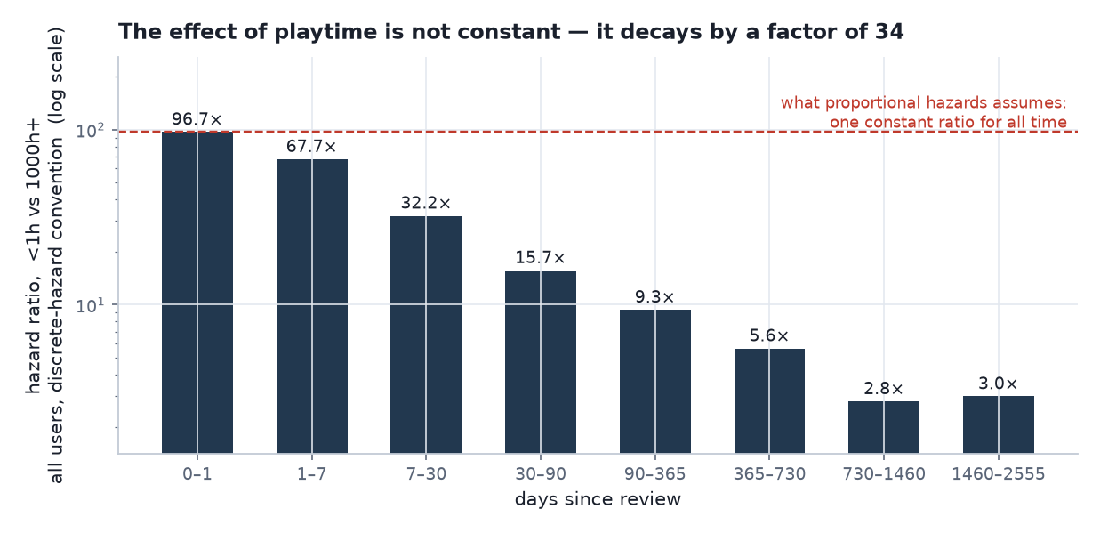 The ratio proportional hazards requires to be constant, measured non-parametrically in eight time bands.
| Band | Hazard ratio, under-1h vs 1000h+ |
|---|---|
| day 0–1 | 96.7× |
| day 7–30 | 32.2× |
| day 90–365 | 9.3× |
| day 730–1,460 | 2.8× |
The ratio moves by a factor of 34. A Cox model would report one number for an effect that demonstrably decays by a factor of 34, and would report it with a tight confidence interval.
So covariates enter through accelerated failure time instead. AFT makes no proportional-hazards assumption, and its coefficients read as “multiplies expected lifetime by X” — which is also the form a product manager can act on without a translation layer.
6. How separated are the segments?
| Segment | People | S(1y) | S(3y) | S(5y) | 5-year expected active days |
|---|---|---|---|---|---|
| under 1h | 15,903 | 31.2% | 17.3% | 8.3% | 401 |
| 1–20h | 102,299 | 55.0% | 29.6% | 12.0% | 686 |
| 20–100h | 58,730 | 74.1% | 45.0% | 19.0% | 961 |
| 100–1000h | 58,686 | 87.7% | 64.9% | 33.3% | 1,252 |
| 1000h+ | 32,285 | 96.0% | 85.6% | 61.2% | 1,561 |
| all | 267,903 | 69.8% | 46.1% | 22.6% | 949 |
A 3.9× spread in expected active days between the extremes. (The log-rank χ² is 28,159, and I am deliberately not leaning on it — at n = 48,188 it is doing exactly the sample-size-driven non-work I just criticised the Schoenfeld p-values for. The 3.9× is the argument.) Playtime cannot be averaged away; it has to enter the model.
These figures are Kaplan–Meier restricted mean survival time over five years, computed on all users. They become the cross-check that catches a real error in Part 5 — because a model can reproduce this table or fail to, and which one it does turns out to depend on a definition nobody had written down.
7. Four questions, four answers, before any model
| Question | Answer | Consequence |
|---|---|---|
| What shape is the hazard? | Three regimes: atom, 212× collapse, flat plateau | No monotone family can fit it |
| Is a cure fraction identifiable? | No — the curve never flattens | No cure model on the pooled sample |
| Does proportional hazards hold? | No — the ratio moves 34× | AFT, not Cox |
| Are the segments separated? | 3.9× in expected days | Playtime must be in the model |
| Is there a late danger window? | No — flat from month 3 to year 3 | Late-tenure campaigns have nothing to target |
None of this required fitting anything. All of it constrains what comes next.
8. What this means for the business
Three of these findings are actionable before a single model is fitted, which is the point of doing this step properly.
Timed retention effort has a window, and it is 90 days. Between month three and year three the hazard is a flat ~1.5% a month, so a campaign aimed at that span is not targeting a risk period — it is sampling a constant background rate, and it buys the same outcome whenever it runs. That is an argument about campaigns, not about late-tenure users: as the box above shows, nearly twice as many people are lost after day 90 as before it. The later loss is the bigger one; it just has no date on it.
A “long-tenured users are leaving” narrative from this data would be an artefact. The hazard does rise after year three. It is also exactly where everyone still at risk joined 2017–2023, and by year six only the 2017–2020 cohorts remain. If someone builds a veteran-retention programme on that rise, they are funding a cohort composition effect. The honest answer is that this design cannot separate the two, and saying so is cheaper than finding out later.
One retention number for the platform is not a summary; it is an average over five different things. Expected active days run from 401 to 1,561 across playtime bands — a 3.9× spread. Any KPI that reports a single figure will move mostly because the mix moved, not because retention did.
The fourth finding is a warning rather than an action: with 245,102 people, every covariate is statistically significant and almost none of that significance is informative. The decision-grade question is never “is this effect real” — it is “how big is it, and does it move”. That is why the proportional-hazards test above is settled on a measured 34× decay rather than on p < 1e-6.
Next: Part 3 — when simple survival models are not enough. I fitted the simplest defensible model first, then the standard parametric families, and let each one fail in a specific, diagnosable way. One of those comparisons is the most informative result in the project — and while writing this series I found that one of the fit statistics I had published was measured against the wrong baseline.