VRChat Retention, Part 4: Five Segments, Five Different Lifecycles
VRChat Retention — a Bayesian survival analysis of 267,903 VRChat reviewers on Steam (not all players — see Part 1), built entirely from public data. Headline: churn risk collapses in the first 90 days and then goes flat for three years, and the five engagement segments are on genuinely different clocks.
Part 1 — the estimand · Part 2 — three regimes · Part 3 — when simple models fail · Part 4 — five lifecycles · Part 5 — from model to decision
The short version
Different kinds of user do not just churn at different rates — they churn on different schedules. A newcomer’s risk collapses over the first weeks; a veteran’s stays almost flat for two years and then drifts up. One curve, scaled up and down, cannot represent that, and a retention plan built on one curve will target the wrong week.
In technical terms: the final model gives every playtime segment its own hazard curve, not its own multiplier on a shared one. A shared curve with per-segment multipliers is proportional hazards, which Part 2 rejected with a measured effect size of 34×.
It wins the model comparison decisively and is 26× more accurate on the published per-segment numbers than the best model that could actually compete. It also has two honest failures I show rather than hide — including a baseline I did not originally fit, which ties with it and shows that the hierarchy earned almost none of that margin. Stratification did.
It also contains a result worth stating on its own terms: hierarchical survival models can be silently unidentifiable in float32. Two models here produced R̂ 4.07 / ESS 4 and R̂ 1.064 / ESS 58 under JAX’s default precision and both converged cleanly with nothing changed but the precision flag — and float64 ran faster, because badly-mixing chains cost more leapfrog steps than double-precision gradients do. I found that by first diagnosing it as structural non-identifiability, writing a convincing explanation, and being wrong.
1. The requirement
Part 3 ended with two half-models. M3 had a free hazard shape and no way to tell people apart. M4 could tell people apart and imposed a rigid shape. Part 2 had already measured a 3.9× spread between segments, so neither half is optional.
So: let the hazard vary freely over time and vary differently for different kinds of user — without letting the sparse corners of that grid produce nonsense.
2. Model 5
Take M3’s 18 free interval hazards and give each of the 5 playtime segments its own version, tied together hierarchically:
\[\log \lambda_{s,k} = \mu_k + \tau \cdot \delta_{s,k}\]In words: start from the population’s lifecycle hazard, then let each segment deviate from it in each interval, and let the data decide how far segments are allowed to drift.
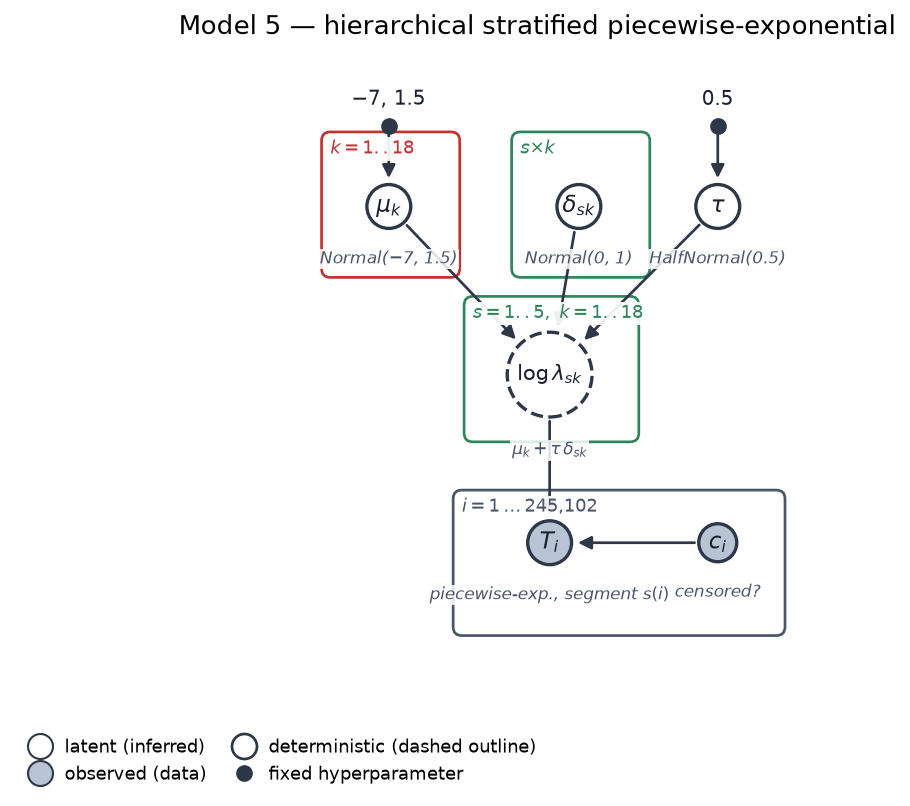 μ is indexed by interval, δ by segment and interval, τ is a single scale. Open circles are latent, shaded are observed, dashed are deterministic, boxes are plates. Drawn in the unconstrained form for readability; the fitted model draws δ on an orthonormal sum-to-zero basis (4 × 18) — the same model in different coordinates, see §6.
| Symbol | What it is |
|---|---|
| μk | the population log-hazard in interval k — the curve Part 2 measured |
| δs,k | how segment s deviates from it in that interval |
| τ | how far segments are allowed to drift, learned rather than assumed |
That is 18 + 90 + 1 = 109 parameters describing 5 × 18 = 90 segment-by-interval hazard cells. The version actually sampled has 91 free parameters, because δ is drawn on a sum-to-zero basis (4 × 18 instead of 5 × 18) — see §6.
The design decision the whole model turns on
δ is free in both s and k. If it depended only on the segment, each segment would get one constant multiplier on a shared curve — which is exactly proportional hazards, the assumption Part 2 rejected. Free in both indices, each segment gets its own shape.
3. Why partial pooling, and not the two obvious alternatives
Ninety cells sounds comfortable until you look at the corners. Segment membership is very uneven — the under-1h segment contributes 8,836 events, the 1–20h segment 81,558. The thinnest cell in the grid holds 10 events, and it is not where you would guess: it is the 1000h+ segment at days 1–3, an early interval where almost nobody in that segment churns. The next three thinnest are also 1000h+ early intervals (19, 22, 25 events). Sparsity here is a property of the strongest segment, not only of the long tail.
| Approach | What it does |
|---|---|
| Complete pooling | one curve for everyone — throws away a 3.9× difference we measured |
| No pooling | 90 independent estimates, one per cell |
| Partial pooling | segments may differ, but are pulled toward the population unless the data insists |
The textbook argument for partial pooling is that a cell with ten events produces a wild estimate and states it confidently. That is the right reason to reach for it, and it is the reason I did.
It is also, on this dataset, wrong — and §7 shows the measurement. With 245,102 people and no empty cells, the likelihood dominates the prior almost everywhere. Partial pooling moves the thinnest cell by 21.7% and the median cell by 0.04%, and the effect on anything published is negligible. I fitted the hierarchy expecting it to matter; it does not, and saying so is more useful than the textbook sentence.
4. τ is learned, and the data overrules the prior
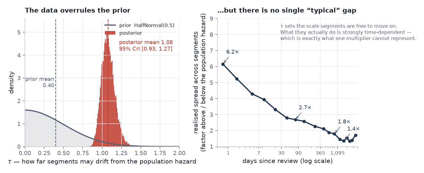 Left: the prior is HalfNormal(0.5), mean 0.40; the posterior sits at 1.08, 95% CrI [0.93, 1.27]. Right: what the segments actually do — the realised spread, interval by interval.
What the segments actually do: they sit a factor of 6.2× apart on day one, 2.7× apart at days 60–90, 1.8× at years 2–3, and 1.4× across years four to five. No single multiplier describes that — which is exactly what a proportional-hazards model would have been forced to assume, and exactly why this model does not.
That spread is a result, not a parameter. The parameter behind it is τ, the model’s internal knob for how far segments may drift from the population curve. Its prior mean is 0.399; its posterior mean is 1.08, 2.7× higher, and the two barely overlap — so the data, not the prior, decided how different the segments are.
τ is worth watching but not worth quoting.
exp(1.08) = 2.94is not the typical gap: δ is drawn on an orthonormal sum-to-zero basis, which gives it a marginal variance of 0.8 rather than 1, and the posterior shrinks it further. Quote the realised spread above instead.
The result worth keeping is neither number. It is that one population curve is not an adequate description of VRChat retention, and the model says so from the data rather than from an assumption.
5. What the model learned
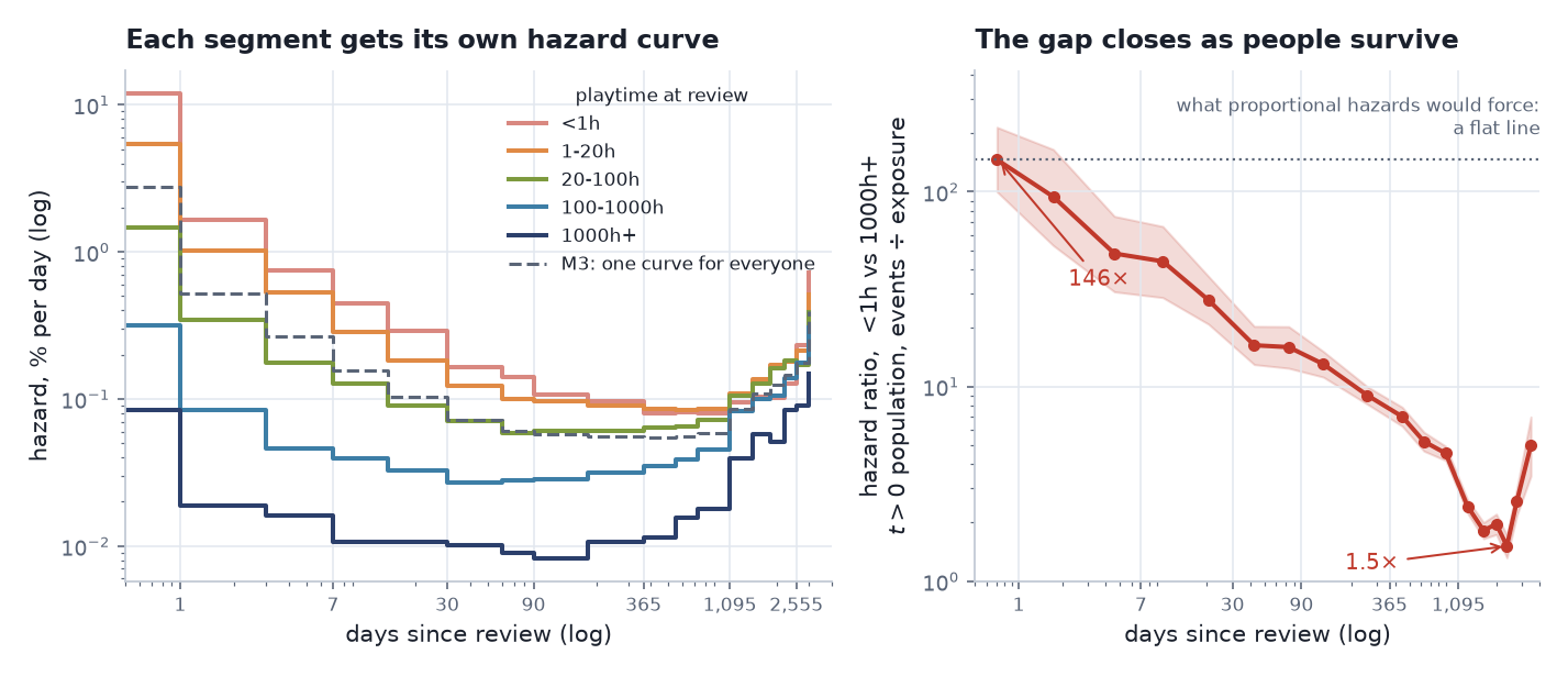
Left: each segment’s own hazard curve, with M3’s single shared curve for comparison. Right: the ratio between the weakest and strongest segment, with a 95% credible band.
Two things are visible here that no proportional-hazards model could represent.
The gap is enormous early and small late. In plain terms: 59% of the lightest band is inactive by day 90, against 1.4% of the heaviest. In hazard terms, the fitted ratio between under-1h and 1000h+ runs 146× on day 0 down to 1.5× by year 6. The curves converge. Proportional hazards would force that ratio to be a flat line, and Part 2 measured non-parametrically that it is not.
One reconciliation, because the series has been bitten by this before: Part 2 reported this ratio as 96.7× in the day 0–1 band, and 146× looks like a contradiction. It is not — the two differ on both population and convention. On the same t > 0 population and the same events-÷-exposure convention the model uses, the non-parametric ratio is 153×, so M5’s 146× is slightly below the data rather than above it. Part 2’s 96.7× is the all-users figure on the discrete-hazard convention and is not directly comparable.
The ratio ticks back up in the final bin on the right-hand panel. That bin covers days 3,000–4,000 — beyond the seven-year span of almost the whole sample, holding 748 events in total across all segments — and it is in the region Part 2 showed to be confounded with joining cohort. It is plotted because hiding a wobble is worse than explaining it, but nothing rests on it.
The shapes differ, not just the levels. The heaviest segment’s hazard falls once — about 8× inside the first week — and then sits almost flat for two years before drifting up. The lightest segment’s keeps collapsing for three months. These are different lifecycles, not one lifecycle at different heights.
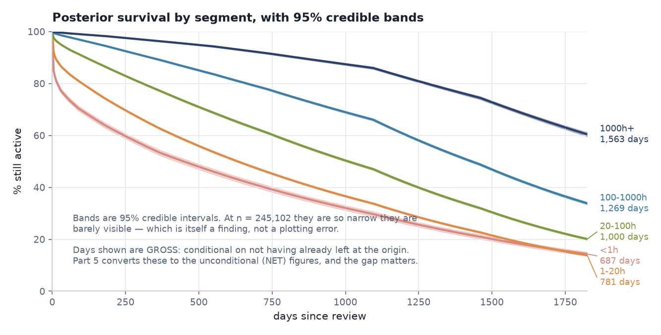 Posterior survival per segment with 95% credible bands, and 5-year expected active days (gross).
These curves are conditional on
t > 0, and that conditioning is not neutral across segments: the under-1h band loses 41.9% of its members to it, the 1000h+ band 0.4%. So the under-1h curve describes the 58% of that band who were still playing when they wrote their review — a survivor group — while the 1000h+ curve describes essentially the whole band. The comparison is still the right one for a hazard model, because the already-gone population has no hazard to model; but the value figures in Part 5 put them back, and that is where the two populations are reconciled.
6. Identifiability, and the mistake worth publishing
The likelihood is redundant here: for any interval k, add a constant ck to μk and subtract ck/τ from every δs,k in that interval, and log λ is unchanged. The invariance holds independently in each interval, so there are K = 18 flat directions, not one.
That redundancy is real, and the model is still fine, because the Normal(0,1) prior on δ is proper and curved along exactly that direction. The posterior is proper. The model is weakly identified by the data and identified by the prior — workable, and worth stating plainly rather than hoping nobody asks.
The main methodological lesson of the project
The first version of this section reported R̂ 4.40, ESS 4 for the unconstrained parameterisation and attributed it to structural non-identifiability. That is a plausible story: the likelihood really does have flat directions, and flat directions really do wreck samplers. I wrote it up.
Then I tested the claim directly. Under float64, with identical sampler settings, the same model gives R̂ 1.0012, ESS 4,270.
The failure was precision, not statistics. Two separate convergence failures in this project were blamed on statistics and both turned out to be float32 — this one, and the random-walk prior in Part 3.
A plausible statistical story is not evidence. Re-run the diagnosis after changing the environment.
Why float64 matters specifically here
JAX defaults to float32, about 7 significant digits. Survival likelihoods accumulate cumulative hazard over thousands of days and then difference the results in the censored tail — and the curvature that identifies a hierarchical scale parameter can be many decimal places down.
Because this is the load-bearing claim of the section, I re-ran both models from a standalone script for this write-up: same model code, same data, same seed, same sampler settings, with only the precision flag changed.
| float32 | float64 | |
|---|---|---|
| M3, random-walk prior | R̂ 1.064, ESS 58 | R̂ 1.008, ESS 649 |
| M5, unconstrained | R̂ 4.07, ESS 4 | R̂ 1.002, ESS 4,566 |
| Helmert basis orthonormality | error 6.0e−8, fails the 1e−9 assertion | error 4.4e−16, passes |
(The project’s own logs record R̂ 1.0045 / ESS 682 and R̂ 1.0012 / ESS 4,270 for the float64 arms, from a slightly different sufficient-statistic path. Same conclusion either way.)
One thing I expected and did not get: float64 was faster, not slower — 72 s against 98 s for M3, 40 s against 78 s for M5. A double-precision gradient costs more per leapfrog step, but the float32 chains were mixing so badly that NUTS took many more steps per draw. On a well-behaved model float64 costs roughly 2×; on these two it cost nothing at all.
The orthonormal Helmert sum-to-zero basis is still kept, but for two reasons that are not convergence: it makes μk unambiguously the mean log-hazard in interval k rather than an arbitrary offset, and it runs 5.3× faster because there are 18 fewer parameters to move. Both parameterisations agree on the fitted hazards to 0.48%, so nothing rests on the choice.
Convergence, final model: max R̂ 1.0029, min ESS 1,464, zero divergences — from 4 chains × 8,000 draws after 6,000 warmup, at target_accept 0.99.
Those are not the project defaults (1,000/1,000 at 0.90, which M1, M2 and M4 use). M5 got a longer run and a stiffer integrator because its hierarchical geometry is harder, and it is worth saying so plainly: a model that needs target_accept 0.99 is telling you something about its posterior. What it is not telling you here is that the model is broken — R̂, ESS and divergence count are all clean, and §6 shows the one genuine geometry problem was precision rather than structure.
7. Did the complexity earn its place?
109 parameters can fit a lot. So the test is out-of-sample, on the same fixed 25,000-person subsample every model was scored on.
M5 wins by 2,486 elpd over M3 and 5,326 over M4 (PSIS-LOO). The paired comparison, computed pointwise on the same people, puts those differences at 2,493 ± 66 and 5,334 ± 120 — 38 and 44 standard errors. The two sets of differences come from slightly different computations, which is why they are quoted separately rather than divided into each other.
The baseline that shows what actually earned that margin
Those comparisons are against models that cannot tell segments apart at all, which makes them the wrong test of the hierarchy. The right test is the one I did not originally run: five completely independent piecewise-exponential fits, one per segment, no pooling and no MCMC — just events ÷ exposure in each of the 90 cells, which is the exact maximum-likelihood estimate.
| log predictive density, same 25,000 people | per-segment 5-year RMST error | |
|---|---|---|
| M5, hierarchical, 91 sampled parameters | −144,138.5 | 2.94 days |
| No pooling, closed form, no sampler | −144,138.3 | 3.01 days |
A difference of 0.2, against a margin of 2,486 over M3. The entire gain came from stratifying. The hierarchical layer contributed essentially nothing.
That is worth stating plainly because it is the third time in this project the same thing has happened. The random-walk smoothing prior in Part 3 agreed with independent priors to 0.25%. Five covariates on the wrong hazard shape were worth less than nothing. And now a hierarchy that shrinks the sparse cells changes the published numbers by 0.07 days. Every piece of machinery I added to borrow strength turned out to have nothing to do, because the data is dense enough to speak for itself. What bought the result each time was structure — the hazard shape, and the stratification.
So was the hierarchy a waste? Not quite, and the distinction matters:
- It does exactly what it is supposed to. The thinnest cell (1000h+ at days 1–3, 10 events) is shrunk by 21.7%; the median cell moves by 0.04%. The shrinkage is correctly targeted — it just lands on cells that barely affect a five-year integral.
- It is the difference between a model that works and one that does not at a tenth of this sample size. At 1% of the data, 10 of the 90 cells contain zero events, where no-pooling returns a hazard of exactly zero — implying those users never churn. Partial pooling still produces a sensible answer.
The honest summary: partial pooling was insurance that turned out not to be needed at n = 245,102, and I would buy it again at n = 25,000. Reporting it as the thing that made M5 work would have been wrong, and I only found that out because I fitted the baseline that could have embarrassed it. A second summary of the same evidence agrees: Bayesian stacking, which picks the weights that maximise the pointwise predictive density of a mixture of the seven models, gives M5 a weight of 0.948 and M4 the remaining 0.052. Everything else gets zero. It is not independent evidence — it reuses the same pointwise log-likelihoods on the same 25,000 people — and in this implementation it stacks the in-sample pointwise density rather than the PSIS-LOO corrected one. The gap between the two is about 9 elpd on a 2,486-point margin, so the weights would barely move; I flag it because “independent check” would have been the flattering word and it is the wrong one.
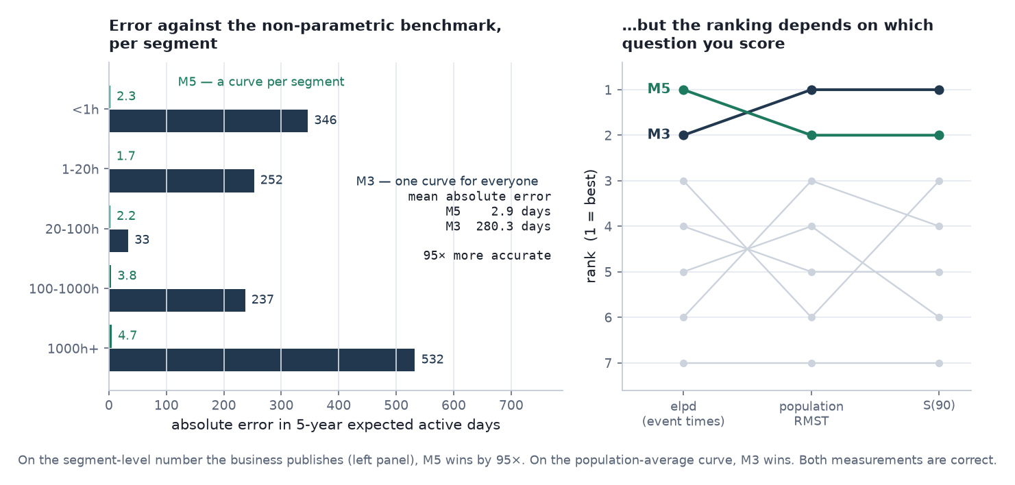 Left: absolute error in 5-year expected active days, per segment, against the non-parametric benchmark. Right: how the seven models rank under three marginal metrics — out-of-sample predictive score, population-average expected days, and 90-day survival. M5 wins the first and M3 the other two; the segment-level metric M5 is built for is the left panel.
On the quantity the business actually publishes — expected active days per segment — M5’s mean absolute error is 2.9 days. (Both the model and the benchmark here are per still-active reviewer — the “gross” basis, conditional on not having already left at the origin. Part 5 converts to the per-reviewer figures and shows why the distinction is worth 72% on the weakest segment.) M3’s, forced to use one curve for everyone, is 280.3 days. That is 95× more accurate, and it is not a subtle difference: M3 is off by 346 days on the weakest segment and 532 on the strongest, in opposite directions, because it is reporting the average of five different things.
8. The failure I am not hiding
M5 is not better on every measure, and the place it loses is instructive.
Scored on the population-average 5-year RMST against the non-parametric benchmark of 1,037.8 days — that is the gross, t > 0 figure; the all-users number in Part 2’s table is 949, and the two differ by exactly the 8.5% already-gone population — M3 is off by −2 days (−0.2%) and M5 by +8 days (+0.7%). M3 wins. Worse, M5’s 95% credible interval for that quantity does not contain the non-parametric value, while M3’s does.
That is genuine over-confidence, and it has a specific cause: at n = 245,102 the posteriors are extremely narrow, so an interval only covers the truth if the model is nearly exactly right. Only 1 of 7 models’ RMST intervals cover it. Narrow-and-wrong is the characteristic failure mode of a mis-specified Bayesian model at large n — confident, quantified, and off.
The defence is not that the miss doesn’t matter — it is a real, priced cost. M5 is worse on the marginal curve, by 8 days and with an interval that fails to cover, and that is the price of a per-segment model. I am paying it knowingly, because the published numbers are segment-level.
The 95× also deserves a harder opponent than M3, which is structurally incapable of producing a per-segment number at all — beating a pooled model at a stratified task is close to a tautology. M4 can produce one: it has playtime as a covariate. Its per-segment mean absolute error is 76.1 days against M5’s 2.9, so M5 is still 26× more accurate than the best model in the ladder that could actually compete. M4’s errors are also all in the same direction and largest at both ends (−143 days on the weakest segment, −123 on the strongest), which is the rigid-shape signature again.
But notice what just happened: three metrics, and the winner is not the same across them. elpd picks M5. Population-average RMST picks M3. Segment-level RMST picks M5 by two orders of magnitude. All three measurements are correct; they disagree because they ask different questions, and publishing any one alone would have justified a different model choice. That is the subject of Part 5.
9. What this means for the business
The technical result is that segments have different hazard shapes. The commercial consequence is that a single retention KPI is not measuring one thing.
The same metric means different things in different bands. “Percentage retained at day 30” is, for a 1000h+ user, essentially a measure of nothing — their churn risk over days 14–30 is 0.011% a day, and they were never going to leave. For an under-1h user it is close to the whole story: 59% of that band is inactive by day 90, and among the ones who were still playing when they reviewed, a third of everything the band will ever lose has already happened. Reported as one number, the metric moves mostly when the mix of new users moves.
So the review cadence should differ by band. The light bands need day-7, day-30 and day-90 checkpoints, because that is where their entire lifecycle happens. The heavy bands need annual ones — their hazard is nearly flat for two years, so a quarterly review of 1000h+ retention is measuring noise around a constant.
And the gap closes. The hazard ratio between the weakest and strongest band runs 146× on day one and 1.5× by year six. Users who survive the early period converge toward a common background rate. That is genuinely good news for the product — it says the platform is sticky once people are in — and it says the leverage is upstream, in the first weeks, not in retaining veterans.
The uncomfortable version of the same point: if your retention dashboard aggregates across bands, it will look most stable exactly when the weakest band is collapsing, because the weakest band is only 5.9% of users while the bands that barely move are 34%.
Next: Part 5 — from a survival model to a product decision. What the model says a user is worth, the error in my own value table that changed a headline number by 72%, and the line between what this evidence supports and what would need an experiment.