Campaign Measurement Part 3: Where should the next marketing dollar go?
Calibrating a media mix model with a geo experiment by reweighting, without counting anything twice, then testing the budget it recommends against the truth and choosing the next experiment.
Co-written with Claude
Privacy first campaign measurement | Part 1: The launch campaign | Part 2: Every channel | Part 3: The next dollar
Part 1’s experiment priced one campaign well. Part 2’s model covers every channel and misprices most of them at the margin. Here I combine the two by Bayes’ rule without counting the same weeks twice, then test the budget the combined model recommends against the simulation’s answer key: the right direction, and about a third of the gain that was available.
4,160 region weeks, 400 held out | importance reweighting and budget search | NumPyro and SciPy | notebook
1. The double counting trap
Parts 1 and 2 give two estimates of the same campaign: 72,706 users from the experiment and 68,215 from the mix model. The obvious way to combine them is to add the experiment to the mix model as one more piece of data. That counts the test weeks twice: the mix model learned about the campaign’s channels partly from those very weeks, and the experiment is a summary of the same weeks, so feeding both to one model treats one piece of evidence as two and makes the result more certain than it should be.
So I refitted the mix model without the weeks in which the experiment measured the effect. Model B never sees weeks 65 to 74 in any region, 400 of the 4,160 region weeks; everything else, the priors, the sampler settings and the other 94 weeks, is as in Part 2’s model, which I call model A from here on. B and the experiment both use weeks 55 to 64, but before the campaign those weeks say nothing about its effect. B converged as cleanly as A, with a largest Rhat of 1.004, at least 1,948 effective draws and no divergences.
The experiment enters as one number with its uncertainty: 72,706 incremental users with a standard deviation of 5,891. Strictly that is a posterior, not a likelihood, but its sceptical prior barely mattered (a nearly flat one gave the same 13.4% lift in Part 1), and it is close to normal, with a skewness of −0.03, so a normal likelihood loses almost nothing.
2. Calibration is Bayes’ rule
With two independent pieces of evidence, combining them is Bayes’ rule. Model C is model B with one more term: the experiment says the campaign brought in 72,706 users, give or take 5,891, so each set of B’s parameters is weighted by how well the campaign it implies agrees with that. C’s posterior is B’s posterior times the experiment’s likelihood.
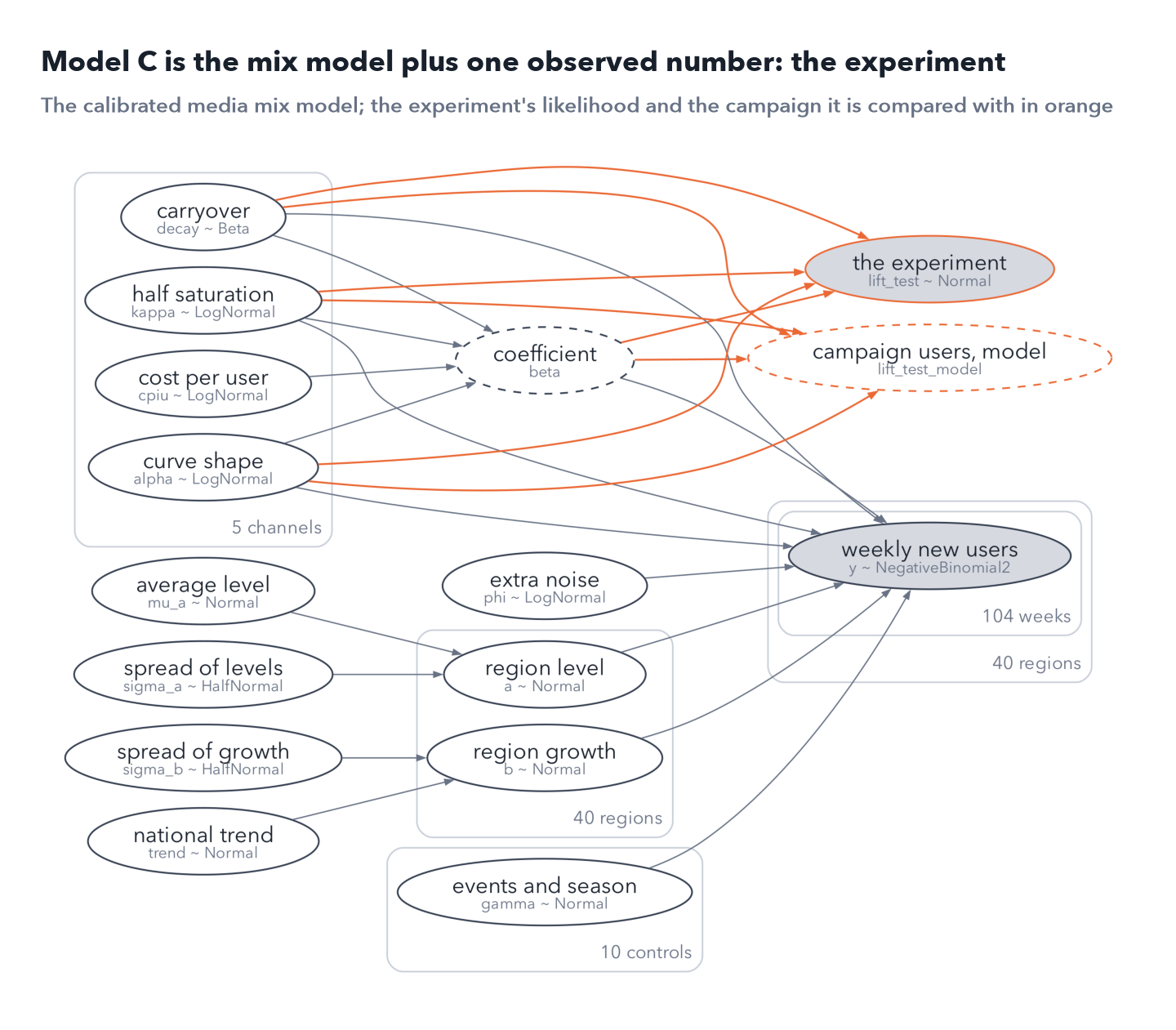
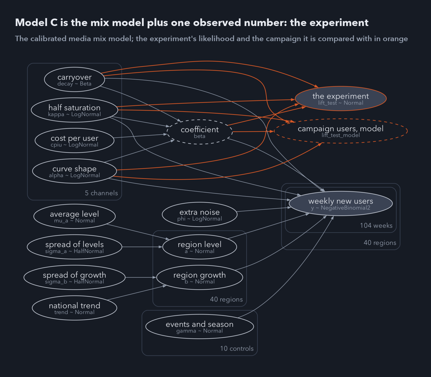 Model C as NumPyro’s render_model draws it: Part 2’s mix model plus the experiment’s likelihood, in orange, which compares the campaign users the model implies with the 72,706 the experiment measured.
The direct way to fit C is to run the sampler again with that extra term; in my runs it stalled twice, and it isn’t needed. Since C’s posterior is B’s times a known function of B’s parameters, B’s draws can simply be weighted by that function: importance sampling, with B as the proposal, exact up to Monte Carlo error. The weights are bounded, since the likelihood can’t exceed its peak, so they can’t explode the way importance weights often do. What can go wrong is overlap: if few of B’s draws agree with the experiment, a handful of draws carry all the weight.
Here the overlap is enough. 27% of B’s draws fall inside the experiment’s 90% interval, weighting leaves an effective sample of 1,323 of the 4,000 draws, and the largest single weight is 0.12% of the total. The Pareto k diagnostic, −1.71, is low as it must be with bounded weights, so it can’t flag poor overlap; the overlap and the effective sample are the checks that matter.
The experiment pulled the estimate a long way. B put the campaign at 58,400 users (90% interval 47,122 to 73,794), and C puts it at 68,128 (59,605 to 76,971). A normal approximation of the same update gives 68,073, with 66% of the weight on the experiment, the more precise of the two.
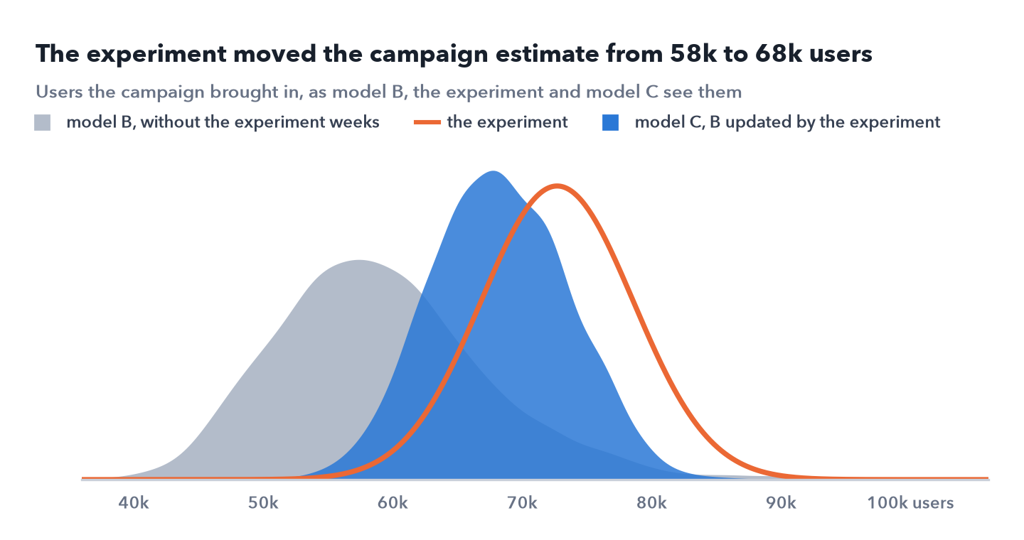
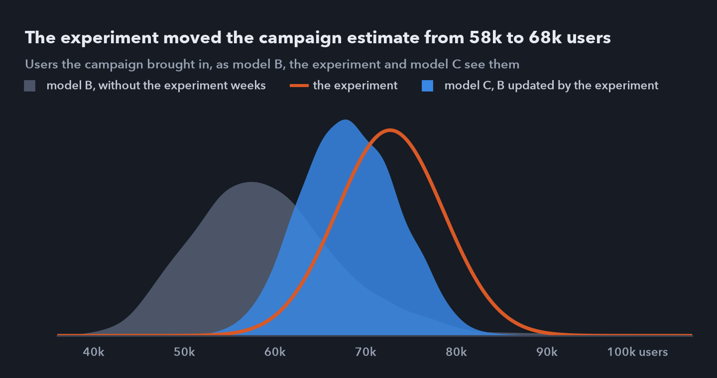 Users the campaign brought in, as model B sees them, as the experiment measured them, and as model C sees them after weighting B’s draws by the experiment’s likelihood. C sits between the two, closer to the experiment, which is the more precise.
3. What calibration changed
All three models can now be graded against the answer key, in which the campaign brought in 70,475 users.
| Model | Campaign users | Campaign error | Average cost error | Marginal cost error |
|---|---|---|---|---|
| A, all weeks | 68,215 | −3.2% | 27.6% | 46.3% |
| B, test weeks dropped | 58,400 | −17.1% | 30.8% | 38.8% |
| C, B updated by the experiment | 68,128 | −3.3% | 29.6% | 38.3% |
The cost errors are averaged over the five channels, ignoring sign. Calibration did what it should: it cut B’s campaign error from 17.1% to 3.3%, level with model A, which had the test weeks in its data. It did nothing else. The average and marginal cost errors barely moved, and none of the three models ranks the channels’ marginal costs correctly. Model A, which saw the campaign’s regional contrast, is no better on the channels: its marginal cost error is 46.3%, against 38.8% for B.
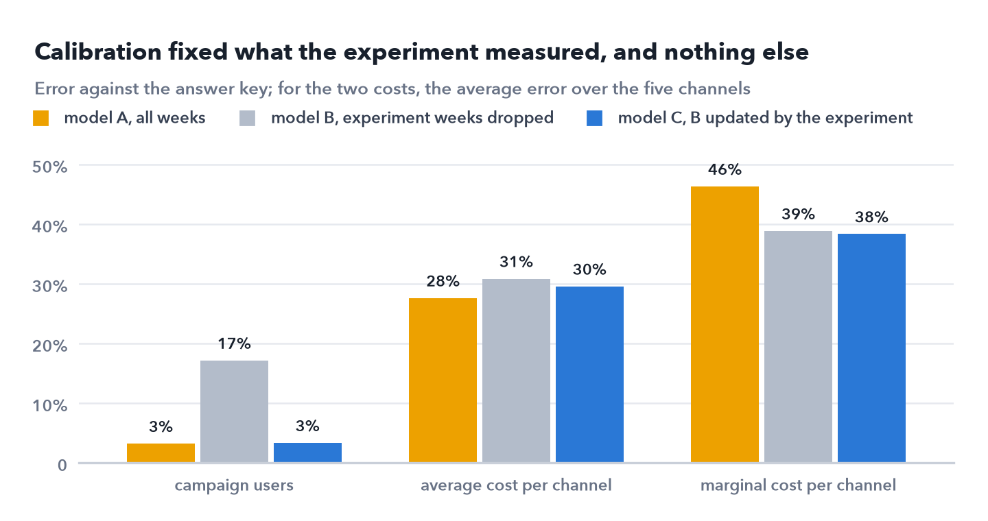
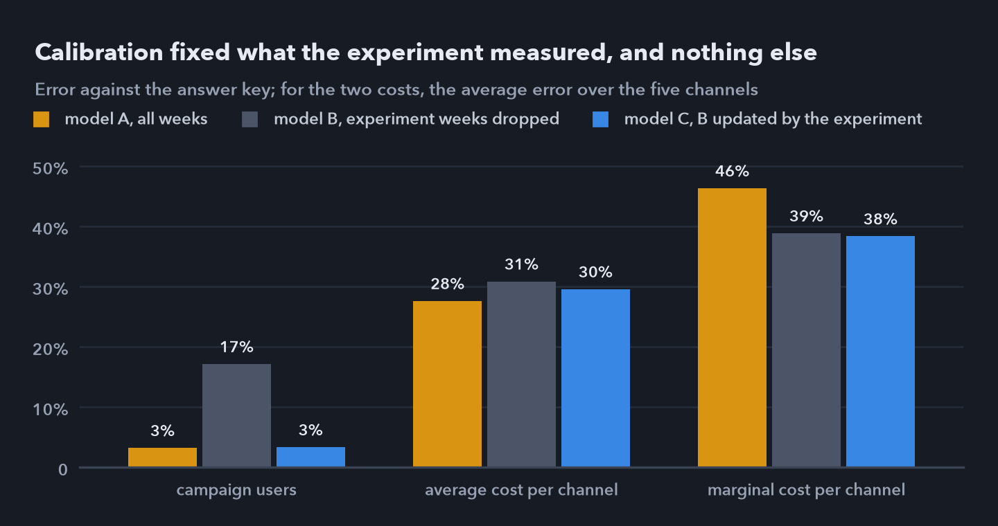 Error against the answer key. For the campaign, the error in incremental users; for the two costs, the average error over the five channels, ignoring sign.
The experiment measured one number, the campaign’s total, which depends on connected TV, out of home and podcasts together, in 20 regions over ten weeks. Many combinations of those three channels’ curves give the same total, and video and search don’t enter it at all, so calibration can move the campaign without moving any one channel’s cost. The average cost of podcasts moved from $13.8 in B to $13.0 in C, and every other channel’s by less.
An experiment calibrates what it measured. To pin down a channel’s curve, the experiment has to vary that channel.
4. A new split for the always on budget
The point of a mix model is the next decision. I gave model C the rules a planner would: keep year 2’s average weekly always on budget, $196,434, and move each channel no further than half or one and a half times its current spend, since the curves are only known near the spend levels in the data. Within those limits it maximises the expected number of new users, averaged over C’s posterior.
| Channel | Now, a week | Model C | Change |
|---|---|---|---|
| connected TV | $72,370 | $73,621 | +2% |
| out of home | $25,177 | $12,589 | −50% |
| podcasts | $19,130 | $28,695 | +50% |
| online video | $48,618 | $48,025 | −1% |
| search ads | $31,139 | $33,505 | +8% |
It moves money from out of home, the dearest channel at the margin by its account, to podcasts, the cheapest, both as far as the limits allow, and adds a little to search. It expects 862 more new users a week (90% interval 638 to 1,095) and puts the probability of any gain at 1.00.
5. Testing the recommendation against the truth
The answer key holds each channel’s true response curve, so any split can be scored at steady spend. Model C’s split adds 321 new users a week, about 0.3% of all new users. The best split under the same rules, found by optimising the true curves directly, adds 1,005, so model C captures 32% of what was available. Model A, without calibration, captures about the same, 331 a week or 33%, as section 3 suggested: calibration changed the campaign estimate and left the curves a split depends on where they were.
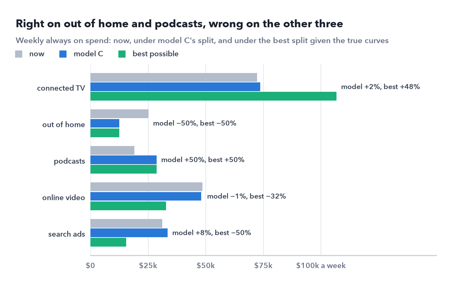
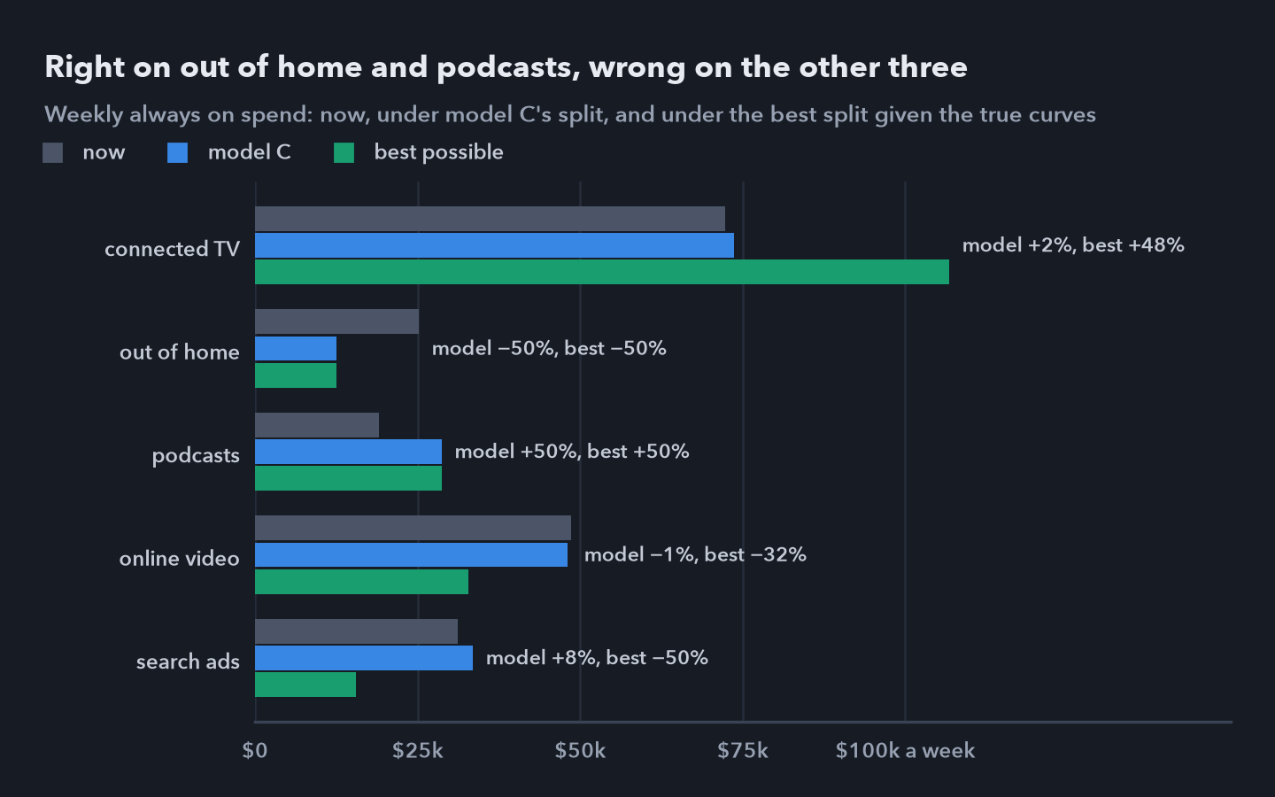 Weekly always on spend now, under model C’s split, and under the best split given the true curves, each channel kept within half and one and a half times its current spend.
Channel by channel, most of the gap between the 862 expected and the 321 delivered sits in out of home and podcasts, the campaign’s own channels, which the experiment measured only together. The best split gains elsewhere, by moving money from video and search into connected TV, three channels model C leaves almost where they are.
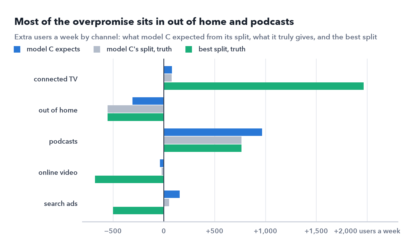
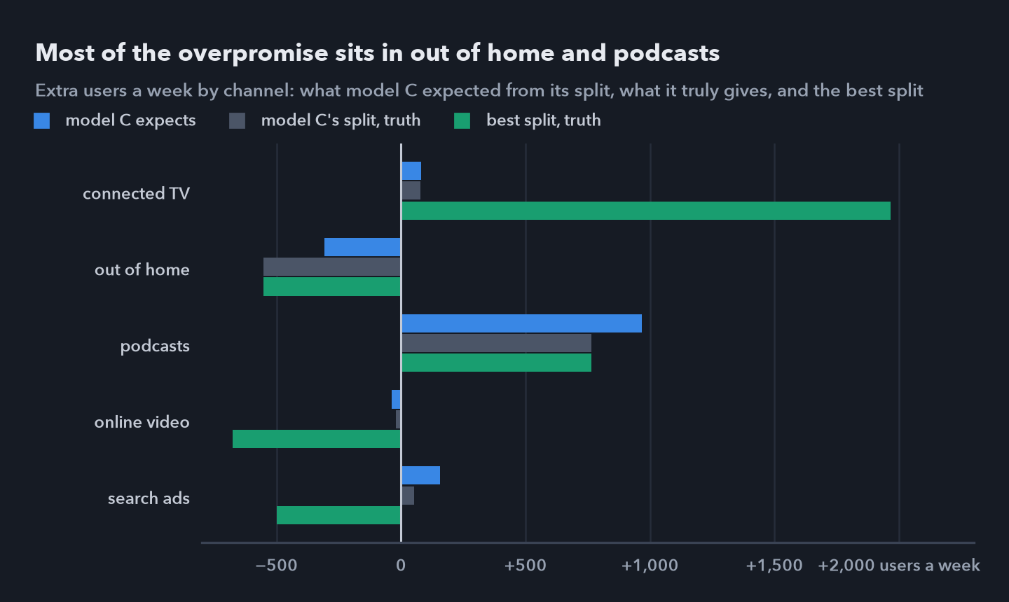 Extra users a week by channel. Model C expected halving out of home to cost 306 users and the extra podcast money to bring 966; in truth they cost 553 and bring 765. The best split gains 1,967 on connected TV and gives up 676 on video and 498 on search.
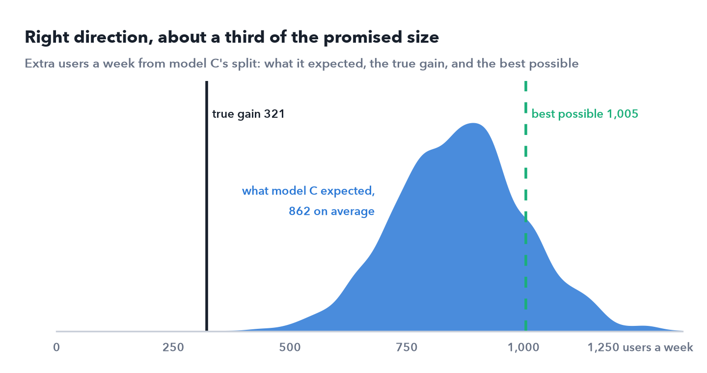
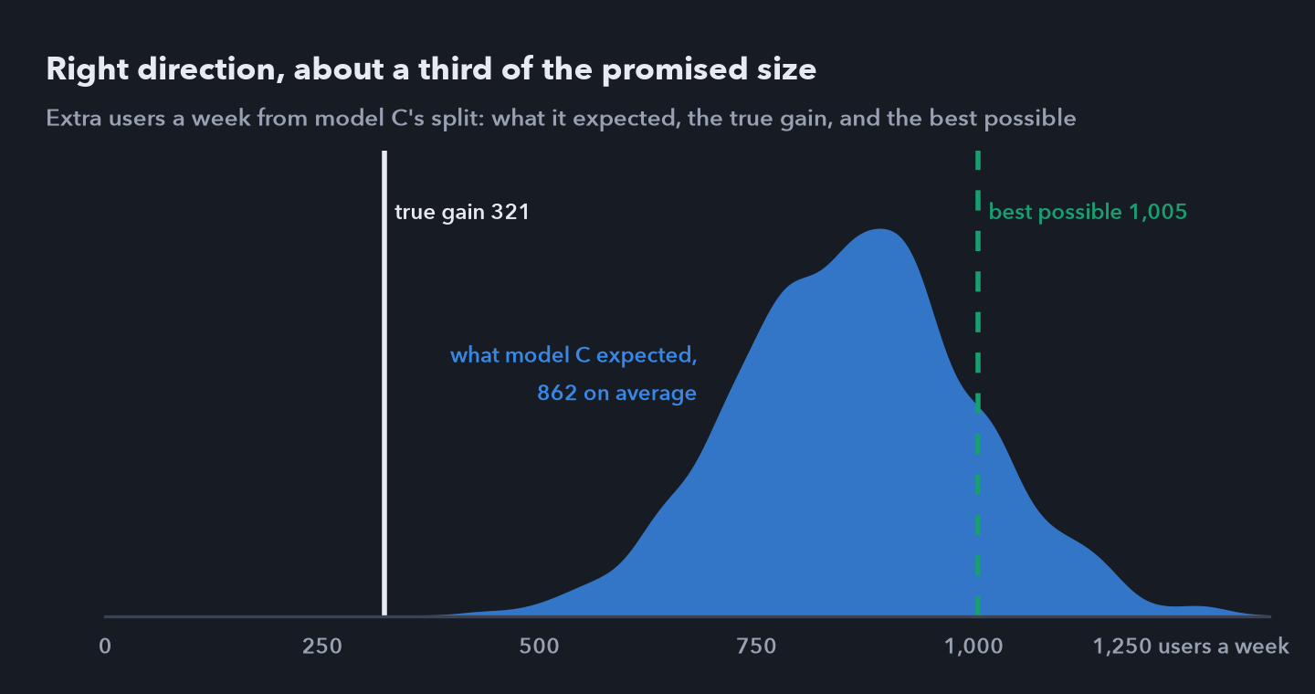 Extra new users a week from model C’s split: its expectation, 862 on average with a 90% interval of 638 to 1,095; the true gain, 321; and the best gain possible under the same rules, 1,005.
The model was also confident: its 90% interval, 638 to 1,095, sits far above the true 321. Its interval reflects the noise in the data it has. It can’t reflect what those data can’t separate, and here that is the channels’ curves.
6. The next experiment
Every miss above traces to one gap: no channel ever varied on its own across regions. The campaign moved three channels together, and video and search never varied by region at all. The next experiment should change one channel at a time, so its curve can be measured alone.
I would start with search: the model would grow it, and its curve rests on one national series. The hard part is size. Switching search off would lower new users by about its share, 2.4% by model C’s account and 1.7% in the answer key, both under the 2.8% lift Part 1’s design detects with 80% power; that design found an injected 2% lift in only 7 of 12 windows. So a search test needs more than the launch campaign had: more weeks, more regions held out, or a stronger contrast, such as more search spend in some regions and none in others.
The answer key points to one more test the model gave no reason to run: connected TV, where the best split finds most of the missing gain. At 3.0% of new users in Part 2’s model, a TV test is only just within the design’s reach.
Test one channel at a time, starting where the decision is most exposed, and size each test to detect an effect of 2% to 3% of new users, far smaller than the launch campaign’s 13%.
7. What I can and cannot say
I can say
- Refitting the model without the experiment’s weeks, then weighting its draws by the experiment’s likelihood, combines the two without counting anything twice, with good overlap and an effective sample of 1,323 draws.
- Calibration cut model B’s campaign error from 17.1% to 3.3%, level with Part 2’s model, which saw the test weeks.
- It left every channel’s cost about where it was: an experiment calibrates what it measured.
- Model C’s split adds 321 new users a week in truth, about a third of what the best split under the same rules adds.
- The next experiment should vary one channel alone, and for search it needs a bigger test than the launch campaign had.
I can’t say
- What video and search are worth at the margin, from these data.
- That the model’s expected 862 a week is a forecast. The true 321 fell outside its 90% interval.
- Whether the test weeks were typical. Calibration assumes the campaign’s channels worked then as they do at other times.
- Anything about real channels, budgets or DuckDuckGo’s marketing. The numbers come from a simulation.
Where this leaves the question. A geo experiment priced the launch campaign within about 3% of the truth (Part 1). A mix model fitted and forecast well but mispriced most channels at the margin, worst the two the campaign never moved (Part 2). Combining them fixed the campaign estimate but left the channels where they were, and the budget split they support captures a third of what was available. The next step is the tool that started the series: a holdout, this time one channel at a time.
Data: simulated, base scenario with seed 7. No real user data and no DuckDuckGo data; Duck.ai and DuckDuckGo are named only to set the scene. Analysis in Python with NumPyro, JAX, pandas and SciPy; the notebook for this part reproduces every result on this page. The code, the simulated data and all three notebooks are in github.com/t3chw/launch-campaign-analysis.