Campaign Measurement Part 1: Did the launch campaign bring in new users, and at what cost?
A simulated case study inspired by Duck.ai: measuring a launch campaign with a Bayesian geo experiment on aggregate counts by region, designed in advance and graded against a known answer.
Co-written with Claude
Privacy first campaign measurement | Part 1: The launch campaign | Part 2: Every channel | Part 3: The next dollar
A six week launch campaign ran in 20 of 40 simulated regions, picked by coin flip. With no user level data, counting tagged installs prices it at $854 an install, and a before and after at $22 a new user. A Bayesian geo experiment, designed on data from before the campaign, puts it at $33 a new user against a $35 target, and because the data are simulated, I can check that answer against the truth.
40 simulated regions | Jan 2024 to Dec 2025 | Bayesian geo experiment in NumPyro | notebook
1. The question
Duck.ai is DuckDuckGo’s private AI chat. This series takes up a question any product built on privacy has to answer: how to measure a big marketing campaign without following anyone from an ad to a sign up. Everything here runs on a simulation I built: 40 regions, two years of daily counts, five marketing channels and one launch campaign. Nothing in it is DuckDuckGo data or describes how DuckDuckGo measures its marketing. A simulation gives up realism for the one thing real data never has, an answer key, so every method can be graded at the end.
The campaign in this world is a launch push: $2.4 million from 24 March to 4 May 2025, weeks 65 to 70 of the data, in 20 of the 40 regions. 55% of the money went to connected TV, 25% to out of home and 20% to podcasts. The target was $35 per incremental new user.
Did the launch campaign bring in new users, and was the cost per incremental new user under $35?
Incremental carries the weight in that question. Every week brings new users who would have come anyway, so the campaign’s effect is the difference between what happened in its regions and what would have happened there without it, and the second number can never be observed. Everything below is about estimating that second number.
2. A simulated world with an answer key
The world has 40 regions, followed every day from 1 January 2024 to 28 December 2025, 728 days in all. It holds 10,492,206 new Duck.ai users and $22.1 million of marketing on five channels. Underneath sit the things that make campaign data hard to read: growth, seasons and holidays, a product launch on 22 July 2024, a news story on 9 April 2025 that lifted every region in the middle of the campaign, and a national advertising flight from 20 October to 30 November 2025. Most channels’ ads keep working for weeks after they run, and past some level of spend each extra dollar buys less.
The data are aggregate counts, the kind a company that doesn’t track individuals could still collect: visits, new users, installs, subscriptions and a brand search index by region and day, and spend and impressions by channel, region and day. No row describes a person. Two rules shape the analysis. Any subscription count under 10 is hidden, which blanks 92% of the daily counts and still 10% of the weekly totals. And the only link from an ad to an install is a tag on downloads that came through a tagged link; connected TV and out of home can’t carry one, and over two years 4,048,373 installs carried none, against 567,922 tagged to search, the most common tag.
The answer key, how many users the campaign and each channel truly brought in, sits in a separate folder that I open only in the last section. One caveat runs through the series: I wrote both the simulator and the models, so the models start closer to the truth than they would on real data.
3. Why tags and a before and after fail
The quickest answer compares the campaign regions with themselves: the ten weeks from launch, weeks 65 to 74, which I call the test weeks, against the ten weeks before, 55 to 64. New users rose 21.7%, which credits the campaign with 110,184 users at $21.78 each. But the holdout regions, with no campaign at all, rose 8.3% over the same weeks.
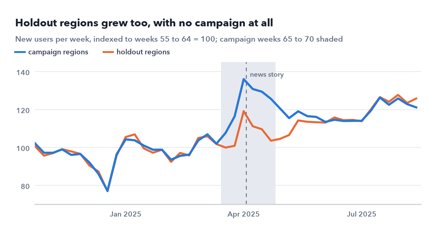
 New users per week in each group, indexed to the average of weeks 55 to 64. Both groups rose over the campaign weeks, shaded, and both jumped in the week of the news story.
The holdout regions went through everything the campaign regions went through except the campaign: spring, growth, and a news story that sent people to Duck.ai everywhere. Subtracting what they did is the job no before and after can do.
Tags fail the other way. Over the same weeks, podcast tagged installs rose by 2,811 against the ten weeks before; credited with the whole $2.4 million, that is $854 an install. Untagged installs rose by 57,204: connected TV and out of home carry no tags, and most people who hear a podcast ad never use its link or code. Search tagged installs rose by 11,854, but a search ad catches people already looking for Duck.ai, whatever sent them, so the tag can’t say whether the campaign or the search ad earned the install.
4. A design fixed in advance
The campaign ran in half the regions by design. Before it started, the 40 regions were matched into 20 pairs on their new users, and one coin flip per pair decided which region got the campaign. Everything in this section uses data up to week 64 only, so the outcome, the model, its checks and the decision rule owe nothing to the test weeks.
The pairs came out close but not identical: from the first five to the last five of the ten weeks before the campaign, the campaign regions grew 0.9% and the holdout regions 2.6%. A gap in trend like that can pass for a campaign effect or hide one, so the model has to allow for it.
The outcome, and what the campaign has to deliver
Subscriptions are closer to value, but I chose new Duck.ai users as the outcome. The ratio of campaign to holdout new users had a weekly noise of 1.7%; for subscriptions it was 6.1%, and many of their weekly counts are hidden. Subscriptions get their own, wider estimate with the result.
At $35 each, $2.4 million has to bring in 68,571 new users, about 13.5% on top of the 507,452 the campaign regions would have had over ten weeks at their pace in weeks 55 to 64. That projection ignores the season and the news, so the decision rests on the cost per user rather than on a lift threshold.
The model
The model is a hierarchical difference in differences on the log of each region’s weekly new users, weeks 55 to 74. Each region has its own level and trend, and may drift a little in the test weeks for reasons unrelated to the campaign; each week has a national effect, which takes up the season and the news story. The campaign regions get a lift in each of the ten weeks from launch, tied to one overall lift, so the effect can build up and fade. The region effects integrate out exactly, which leaves the sampler 37 parameters; the count version I use for subscriptions in section 5 samples all 157.
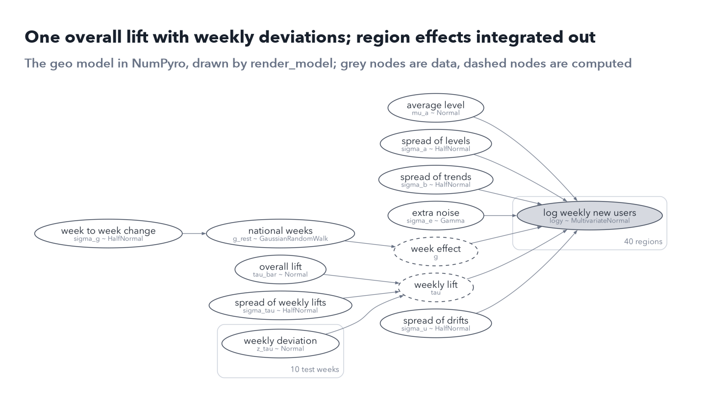
 The geo model as NumPyro’s render_model draws it, with plain names added. Grey nodes are data, dashed nodes are computed from others, and each box repeats its contents, once per region or test week.
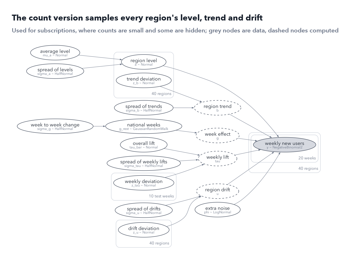
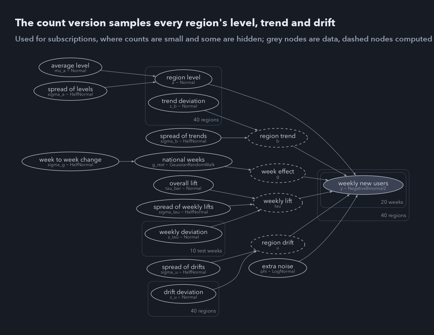 The count version samples every region’s level, trend and drift: 157 parameters against 37.
I set the priors by simulating from them. The chosen ones put 90% of a region’s weekly new users between 31 and 87,454, wide around the observed 637 to 5,180, and the campaign’s lift between −23% and +28%, so they start sceptical: a 0.20 chance of beating break even before any data. Vague priors are not neutral at all: they spread a region’s weekly new users from 2.29 × 10⁻¹¹ to 3.04 × 10¹⁰ and put the lift’s 95th percentile at +26,668%. Giving each week’s lift its own independent prior, with a standard deviation of 0.15, looks as wide but implies a total lift of only −7% to +9%, because ten weeks average out; tying them to one overall lift avoids that.
Can it find an effect, and only a real one?
Two checks asked whether the model can be trusted here. In 40 fake worlds drawn from it, each with a known lift, the 90% intervals held the truth 85% of the time and the 50% intervals 50%; two of these short fits had not converged, with Rhat of 1.34 and 2.24, and without them the 90% figure is 84%. In 36 placebo campaigns, the same analysis on earlier ten week windows with no campaign, using the real assignment and two other sets of coin flips, 34 of the 90% intervals contained zero and the estimates averaged −0.13%. Their spread matched the uncertainty the model claimed, a ratio of 0.99; without the regional drift it was 1.10 and the fake world coverage 80%, so I fixed the drift variant.
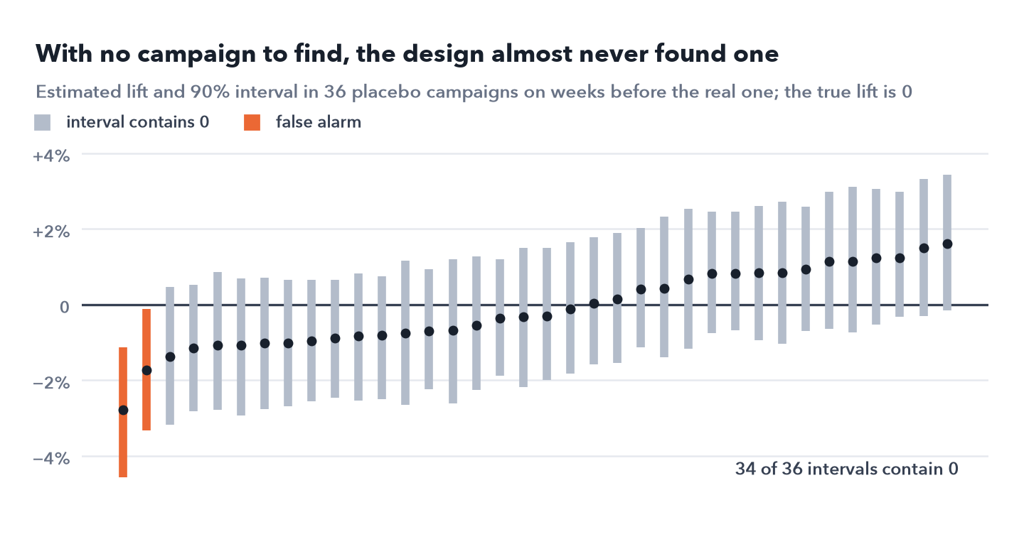
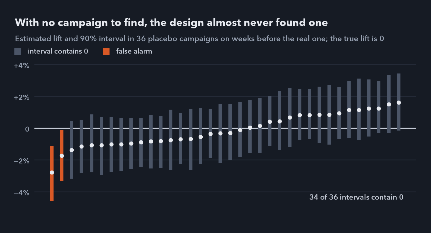 Estimated lift with its 90% interval in 36 placebo campaigns on weeks before the real one, sorted by estimate; the true lift is zero in every one. Two intervals miss zero, about what 90% intervals should do.
Adding a known lift to the placebo windows shows how small an effect the design can see.
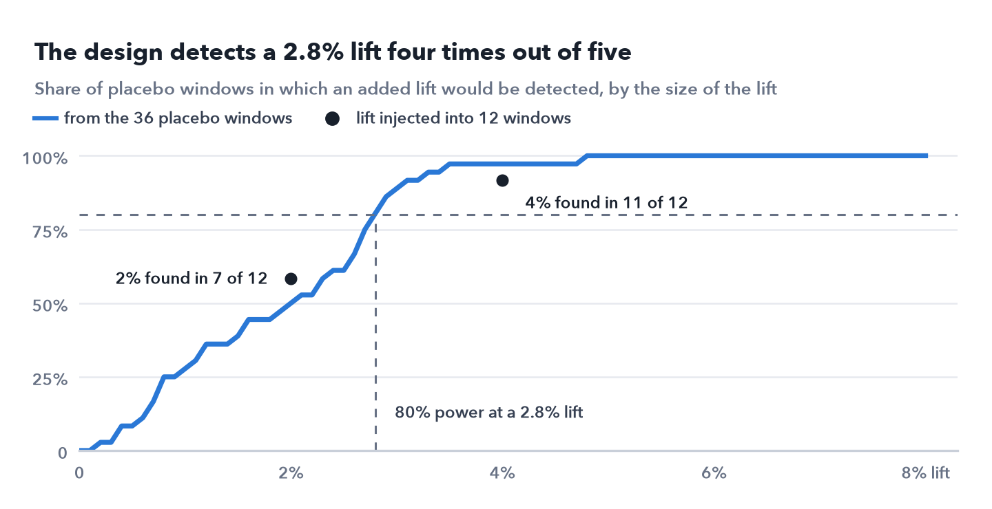
 Share of placebo windows in which an added lift of each size would be detected; the design reaches 80% power at a 2.8% lift. Lifts of 2% and 4% injected into twelve windows were found in 7 and 11 of them.
So the design can easily tell a 13.5% lift from no lift, and the injected lifts came back on average as 2.2% and 4.1%. Pricing is harder: a campaign exactly at break even would be priced somewhere between $31 and $41 per user, 90% of the time.
Real campaigns build and fade, so I also injected a lift that rises to 21% and falls to 3% over ten weeks into six earlier windows. The estimates averaged 13.1% against 12.8% injected and the intervals held the truth in 5 of 6; the miss came in a window whose placebo estimate was already off, by −2.8 points, and net of that the average error was 0.1 points.
Last, the decision rule, written down before the result. If the probability that the lift is above zero is under 0.95, the campaign is not shown to work. Otherwise, a probability of at least 0.80 that the cost per user is under $35 says scale it, 0.50 to 0.80 says improve the mix and test again, and under 0.50 says don’t scale it.
The design can tell a working campaign from a dud with room to spare, but it can’t price a campaign near break even to better than about $5 either way. That is why the rule is written in probabilities of beating the target rather than in a point estimate.
5. The result
With the test weeks open, I ran the model fixed in section 4 on weeks 55 to 74: four chains of 1,000 warmup and 1,000 kept draws. The sampler had no trouble, with a largest Rhat of 1.006, at least 913 effective draws for every parameter and no divergent transitions.
The campaign brought in 72,706 new users over the ten weeks (90% interval 62,991 to 82,319), a lift of 13.4% (11.4% to 15.4%), at $33.01 each ($29.15 to $38.10). The probability that it worked at all is 1.000 to three decimals.
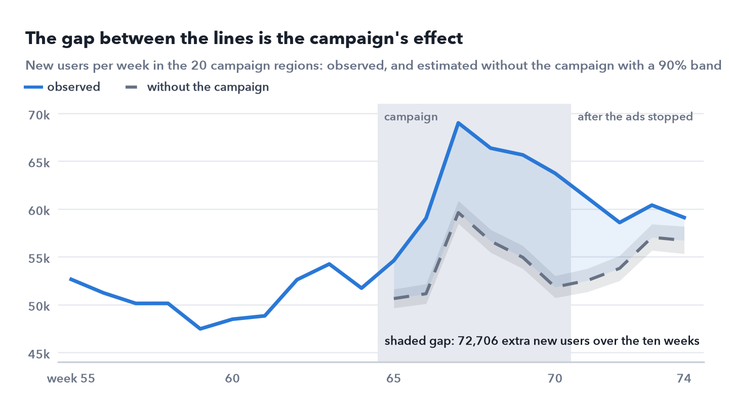
 New users per week in the 20 campaign regions: observed, and as the model estimates them without the campaign, with a 90% band. The shaded gap over weeks 65 to 74 is the campaign’s effect, 72,706 new users.
The lift built up through the six campaign weeks, from 8% to 23%, and wore off over the four after them.
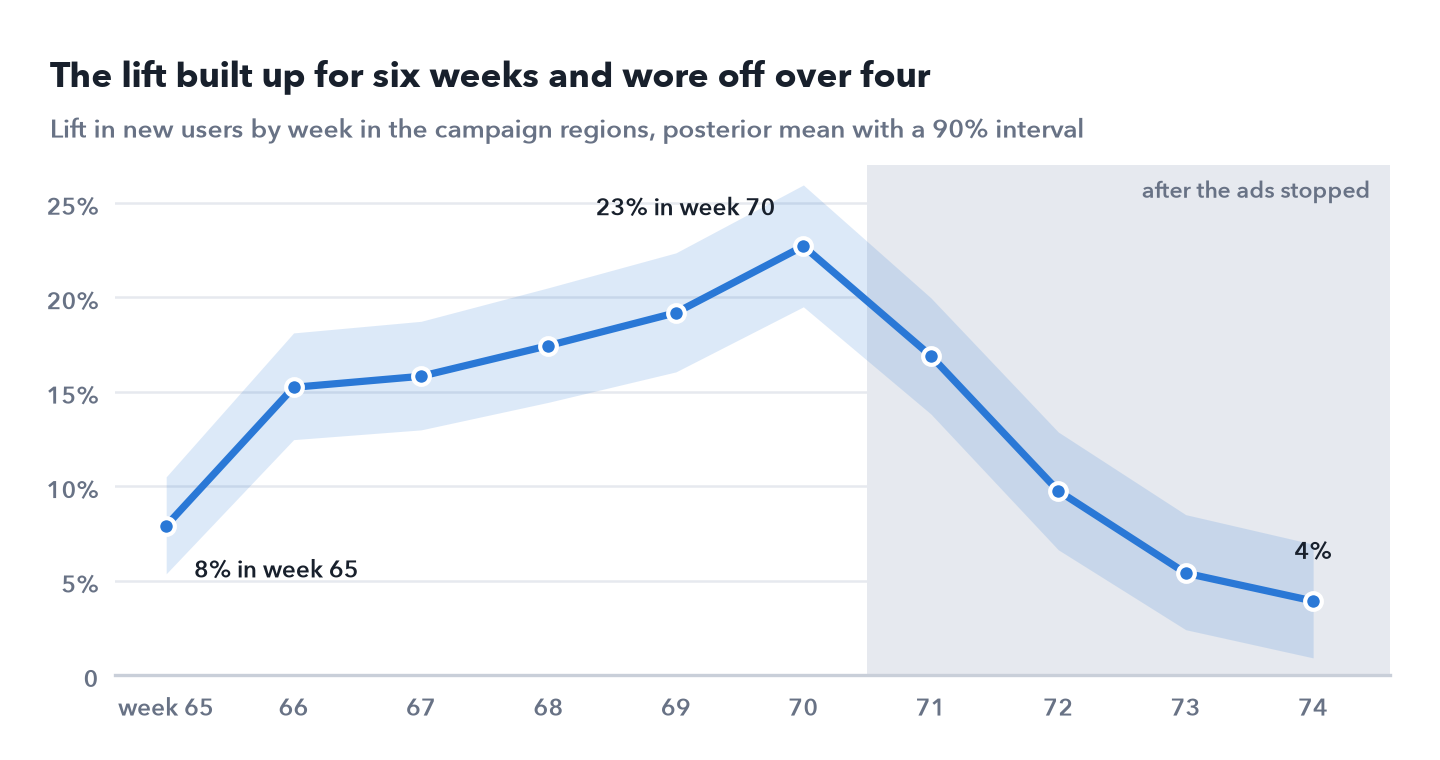
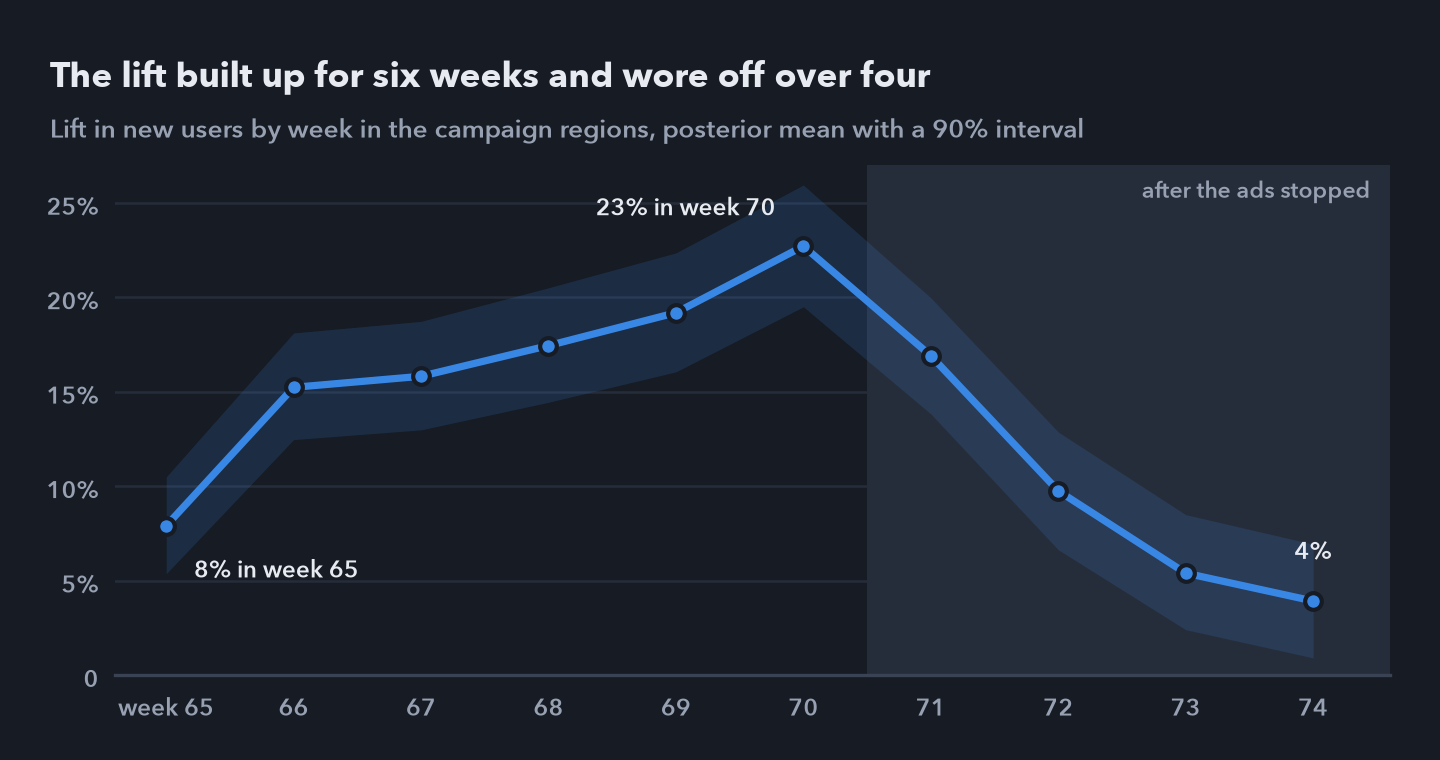 Lift in new users by week in the campaign regions, posterior mean with a 90% interval: 8%, 15%, 16%, 17%, 19% and 23% while the ads ran, then 17%, 10%, 5% and 4% after they stopped.
That tail matters for the price. Fitted to the six campaign weeks alone, the same model finds a 16.4% lift but only 53,231 users, $45 each: 27% of the campaign’s users came after the ads stopped. A readout on the day the campaign ended would have priced it well over the target.
The model also describes the data it was fitted on. 94.6% of region weeks fall inside their 90% predictive intervals, and 95.5% of the holdout regions’ test weeks, where a misfit would bend the estimate of what the campaign regions would have done.
The decision rests on the cost, and there the answer is less clean.
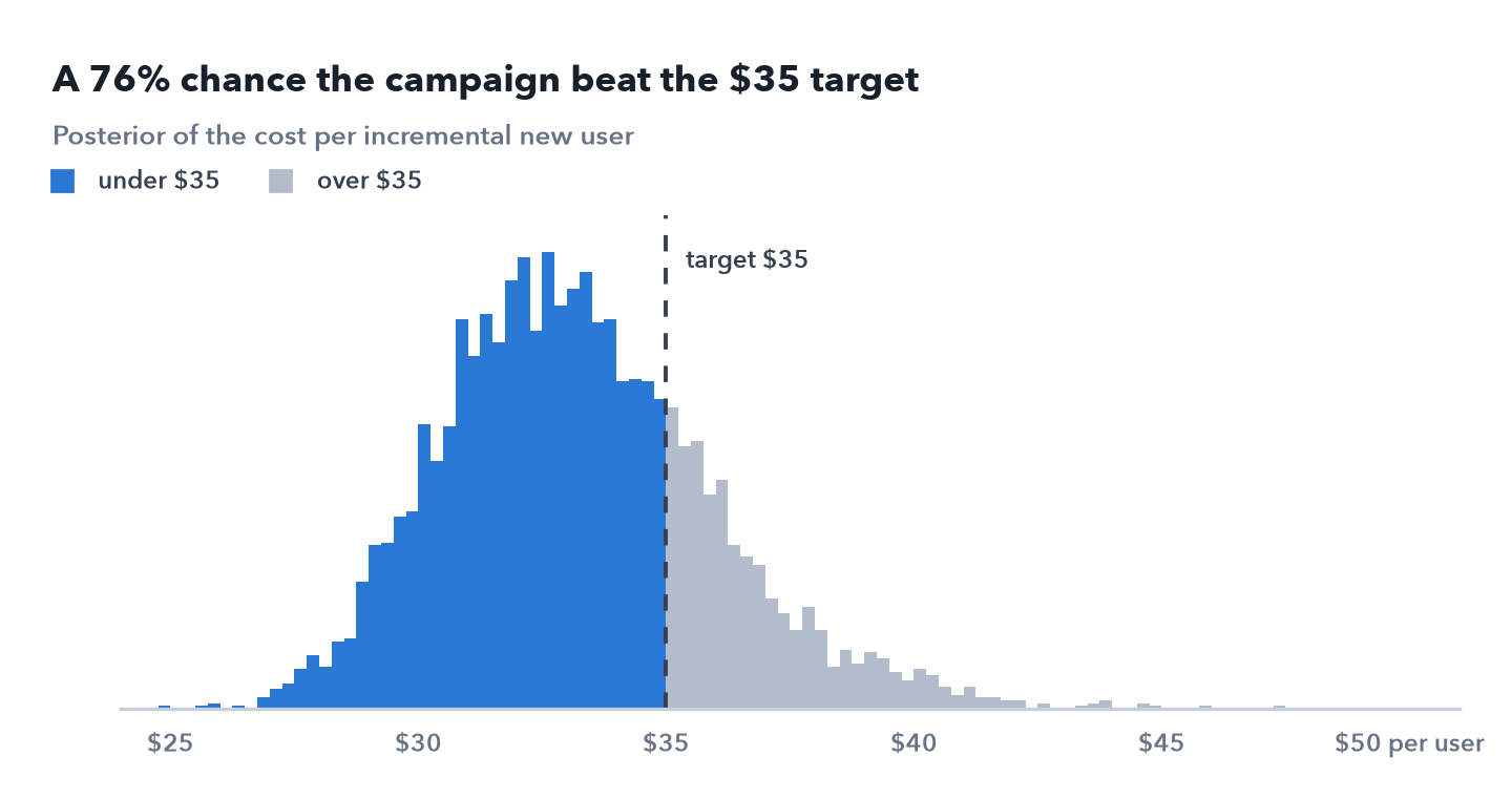
 Posterior of the cost per incremental new user, median $33.01. 75.8% of it lies under the $35 target, a share with a Monte Carlo standard error of 0.008.
Every stage of the funnel moved. Visits moved least, as expected when most come from people who already use Duck.ai, and subscriptions, from the count version, which treats every hidden count as some number under 10 rather than dropping it, carry the widest interval.
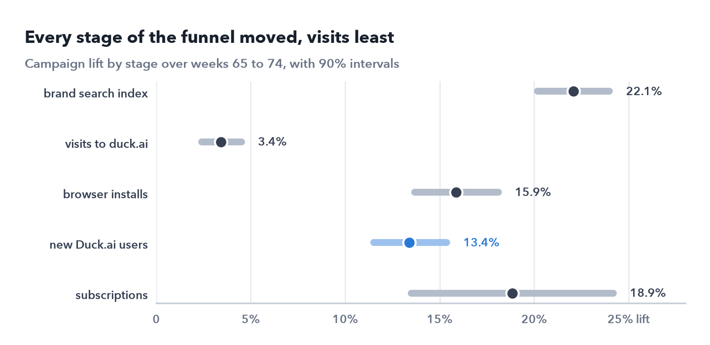
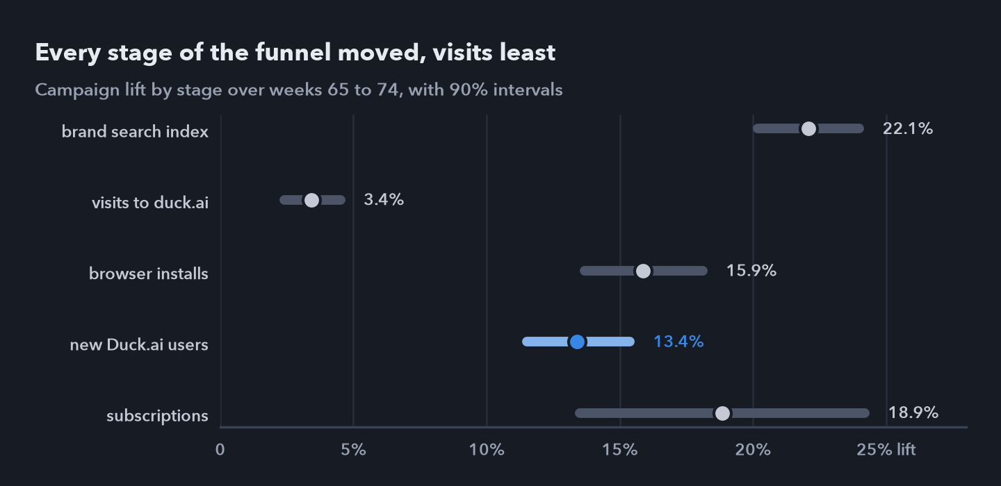 Campaign lift by stage over weeks 65 to 74, with 90% intervals: brand search index 22.1%, visits to duck.ai 3.4%, browser installs 15.9%, new Duck.ai users 13.4% and subscriptions 18.9% (13.5% to 24.2%).
6. How much the answer depends on my choices
Every choice in section 4 was mine, so the result has to survive choices I didn’t make. The first check uses no model at all. If the campaign did nothing, which region in each pair got it made no difference, so I recomputed a simple ratio estimate under every one of the 220 ways the 20 coin flips could have landed, 1,048,576 in all. Only 2 are as extreme as the real assignment, the real one and its mirror image, so p = 1.9 × 10⁻⁶. The ratio estimate is 12.4%, with a 90% confidence interval of 10.5% to 15.0% from inverting the test.
The model’s answer barely moves under other choices. A wider prior on the lift, a nearly flat one, an optimistic prior centred on +10% and the variant without regional drift all give 13.4%, and leaving out one pair of regions at a time gives 12.6% to 14.0%.
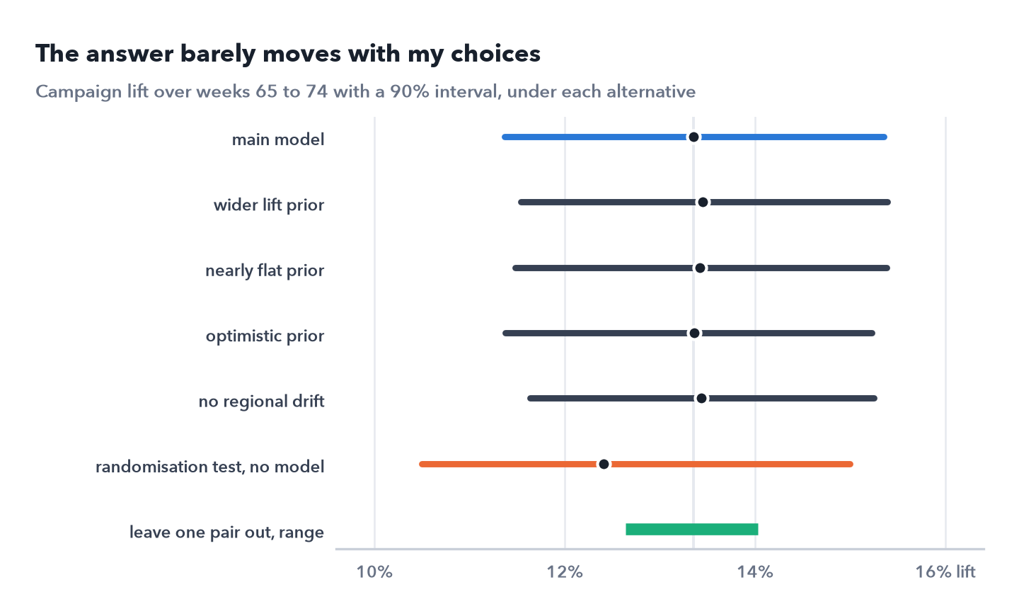
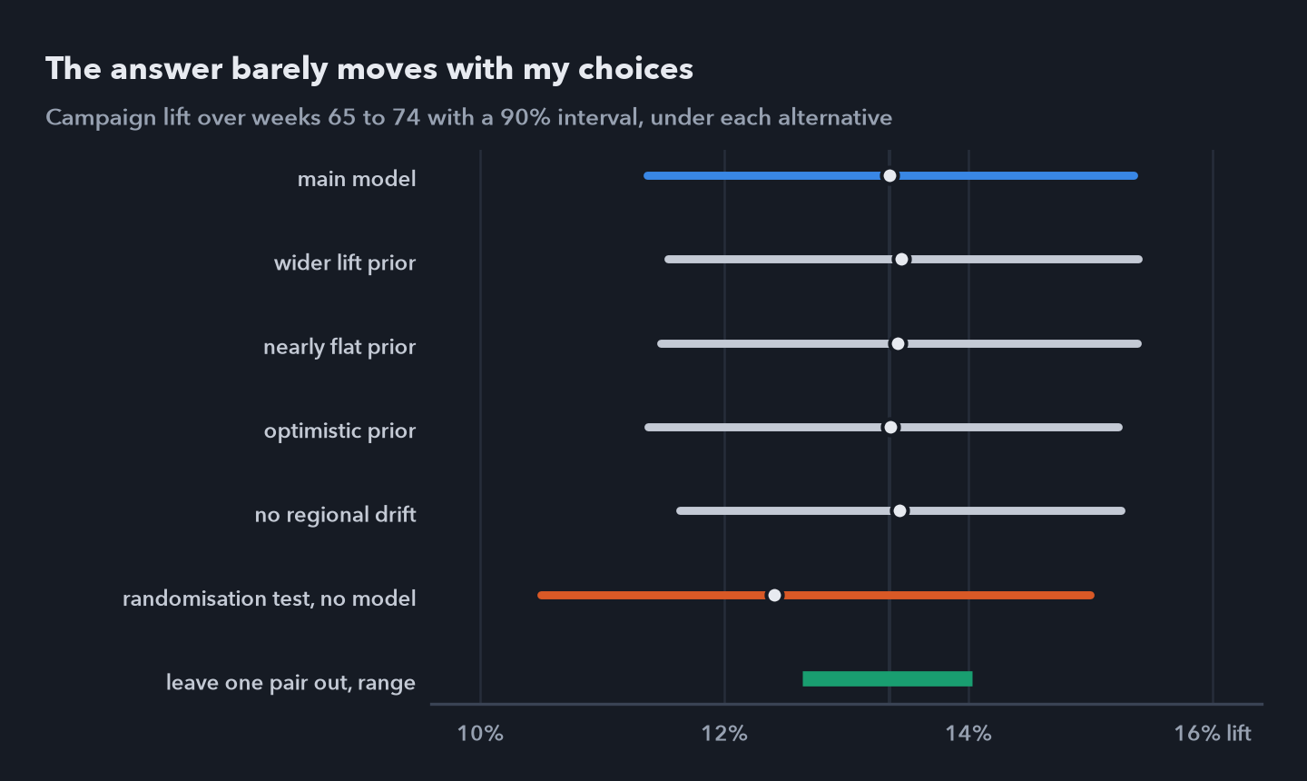 Campaign lift over weeks 65 to 74 with a 90% interval: the main model, four refits with other priors or without regional drift, the randomisation test with no model, and the range of estimates leaving out one pair of regions at a time.
The decision is less stable than the lift. Across the priors, the probability that the cost per user is under $35 runs from 0.77 to 0.79, and the variant without regional drift gives 0.81, just past the 0.80 the rule needs to say scale it. That margin is inside the sampler’s own noise: the main model refitted with two chains gives 0.78 rather than 0.76. The placebo campaigns had already shown that the variant without drift claims too little uncertainty, which is why the design fixed the other one.
The lift is settled: the test with no model, the other priors and leaving out each pair give 12.4% to 14.0%. Whether the campaign beat $35 is not, and only a rule fixed in advance stops the analysis from picking the variant that says scale.
7. The decision, and the answer key
The probability that the lift is above zero is 1.000 and the probability that the cost per user is under $35 is 0.76, between 0.50 and 0.80, so the rule says improve the mix and test again.
In the answer key, the campaign brought in 70,475 new users, a lift of 12.9%, at $34.05 each, and all three are inside the model’s 90% intervals. 51,791 of those users came in the six campaign weeks, close to the 53,231 estimated from those weeks alone. The news story added 12,952 users to the campaign regions over the same weeks, every one of which the before and after counted as the campaign’s.
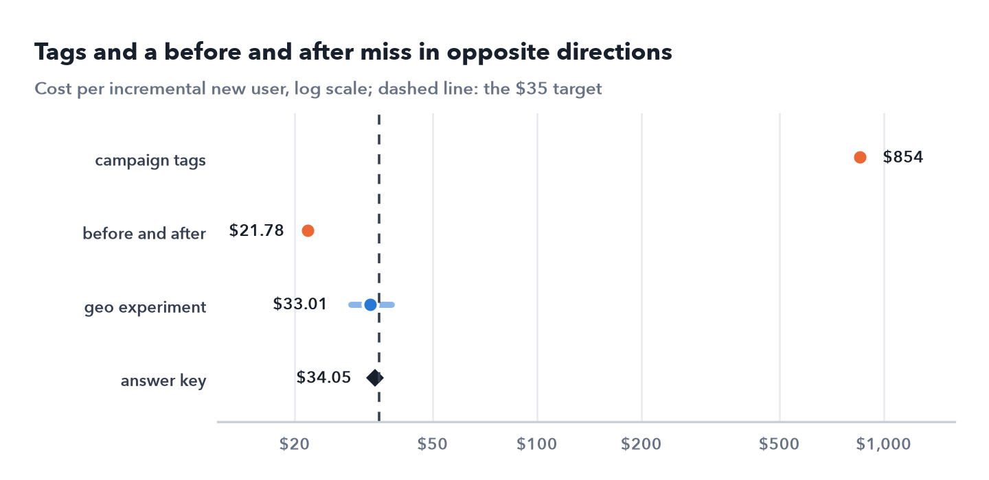
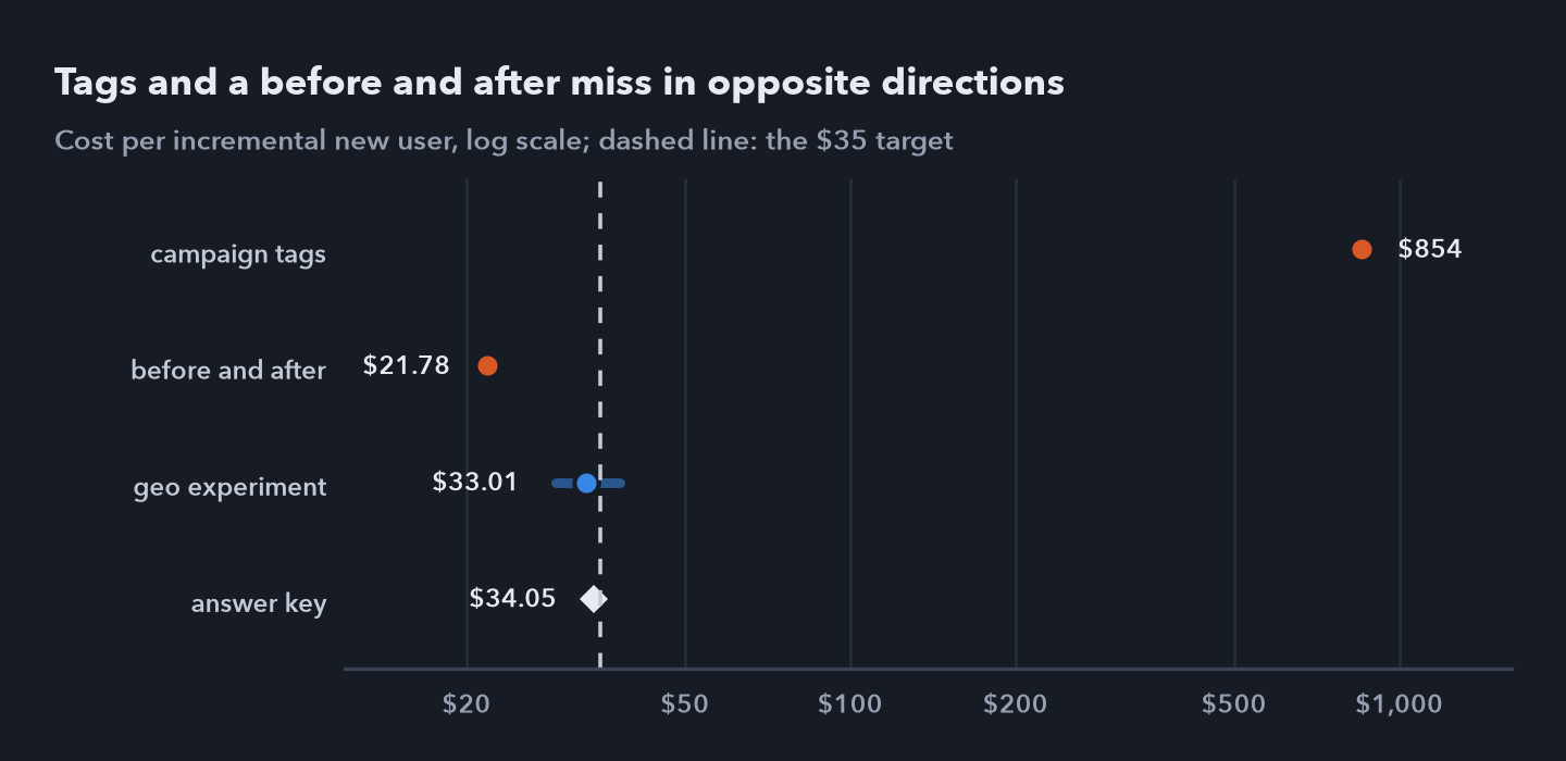 Cost per incremental new user from three approaches and the truth, on a log scale, with the $35 target dashed; for tags, the cost per extra podcast tagged install. Tags miss far too high and the before and after too low; the experiment’s 90% interval contains the truth.
The true cost was 2.7% under the target, well inside the roughly $5 either way to which this design can price a campaign near break even. The campaign did pay, but by a margin the data couldn’t show, which is the case the rule’s middle answer is for. Improving the mix means knowing which of the three channels did the work, and this experiment can’t say: all three ran together in the same regions.
8. What I can and cannot say
I can say
- The campaign brought in about 72,700 new users over ten weeks, a 13.4% lift, at about $33 each. The truth was 70,475 users at $34.05.
- 27% of those users came after the ads stopped; counted over the campaign weeks alone, each would have cost $45.
- The lift holds with no model at all, under four other sets of choices, and without any one pair of regions.
- Where there was no campaign the design found none: 34 of 36 placebo intervals contain zero, and they are as wide as the estimates really vary.
- Tags and a before and after both mislead, in opposite directions: $854 an install and $21.78 a user.
I can’t say
- Which of the three channels did the work. They ran together in the same regions.
- From the data alone, that the campaign beat $35. The probability is 0.76.
- What a bigger campaign, or the same one elsewhere, would cost per user.
- Anything about individual people. The data are counts by region and day, by design.
- How any of this carries over to real Duck.ai marketing. Every number here comes from a simulation.
Next: The experiment priced one campaign. The rest of the $22.1 million paid for always on marketing on five channels, the budget that runs on and off all year outside campaigns, and for a national flight in the fourth quarter; none of it was switched off region by region to test it. Part 2 fits a Bayesian media mix model to all of it, asks whether the data can tell the channels apart, and grades each channel’s cost against the answer key.
Data: simulated, base scenario with seed 7. No real user data and no DuckDuckGo data; Duck.ai and DuckDuckGo are named only to set the scene. Analysis in Python with NumPyro, JAX, pandas and SciPy; the notebook for this part reproduces every result on this page. The code, the simulated data and all three notebooks are in github.com/t3chw/launch-campaign-analysis.