Campaign Measurement Part 2: What does each channel bring in, and what would the next dollar buy?
A Bayesian media mix model in NumPyro for five marketing channels on simulated regional data: whether the data can tell the channels apart, making the sampler work, and every channel's cost graded against the truth.
Co-written with Claude
Privacy first campaign measurement | Part 1: The launch campaign | Part 2: Every channel | Part 3: The next dollar
The experiment in Part 1 priced one campaign. The always on budget behind it, five channels running on and off for two years, can only be split by a model. A Bayesian media mix model fits two years of simulated weekly data from 40 regions and passes the checks I can run without the answer key, yet it misprices the next dollar for four of five channels, worst for the two the campaign never touched.
4,160 region weeks | five channels | Bayesian media mix model in NumPyro | notebook
1. What one experiment can’t say
Part 1 measured one campaign: $2.4 million on connected TV, out of home and podcasts in 20 regions, which brought in 72,706 incremental users over the ten test weeks, 65 to 74. Most marketing isn’t like that. In this world the same three channels, along with online video and search ads, also run on and off all year as always on marketing, and switching each one off in half the regions long enough to price it would cost real users and real money. A media mix model estimates all five at once from the variation the spend already has: how new users moved when spend moved, over time and across regions.
Two features set it apart from a plain regression. Ads keep working after they run, so each channel’s spend is carried into the following weeks with a decay. And past some level of spend each extra dollar buys less than the one before, so the response bends over. That second feature is the one decisions depend on.
How many new users does each channel bring in, and what would one more dollar in each buy?
The average cost per user, everything a channel spent divided by everything it brought in, says whether the channel paid for itself. The marginal cost, the price of the next user at the channel’s typical spend, says where the next dollar should go. Part 3 uses the marginal costs to split the budget again.
2. Can the data tell the channels apart?
A model can only separate what moved separately. The usual check looks at the national weekly spends: the largest correlation any channel has with another is 0.52, and the variance inflation factors run from 1.07 to 1.74, low by any rule of thumb, so on that check the five channels are distinct. It misses where the variation comes from: spend can change over time or differ across regions, and splitting each channel’s spend per person into the two shows the difference.
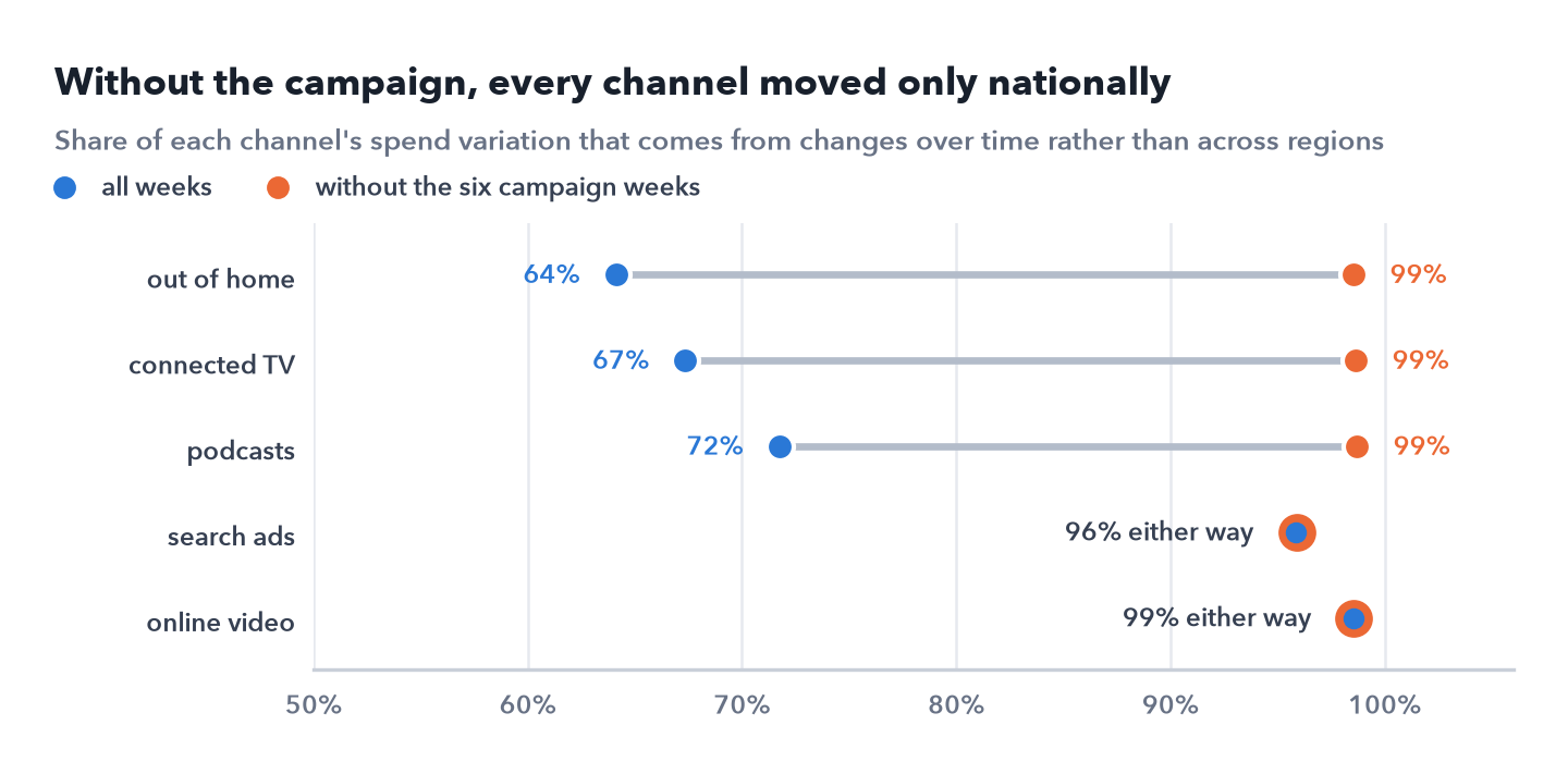
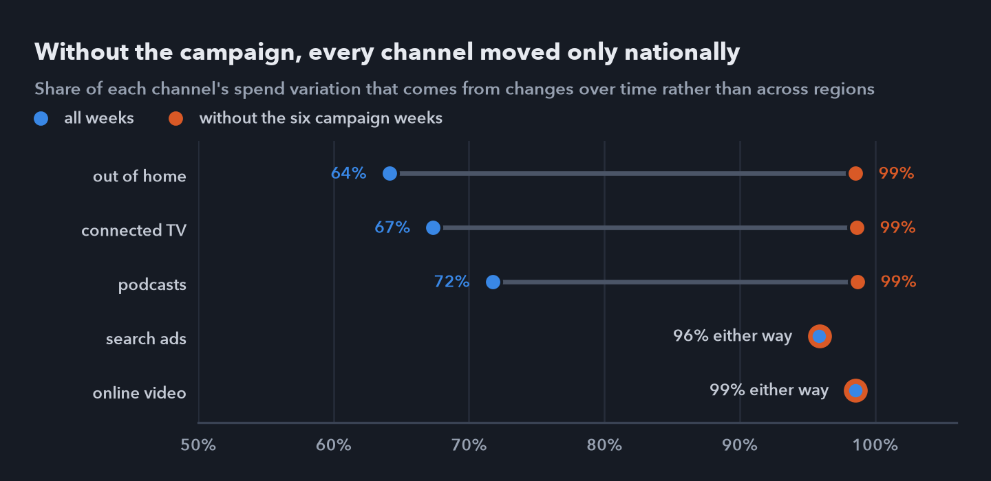 Share of the variation in each channel’s spend per person that comes from changes over time rather than differences between regions, with all weeks and without the six campaign weeks.
Every channel’s always on spend followed one national calendar, split across regions by population. The only regional contrast in two years came from the campaign: with its six weeks, about a third of the variation in connected TV, out of home and podcasts is between regions; without them, 96% to 99% of every channel’s variation is over time. Online video and search were never in the campaign, so everything the model learns about them comes from one national series, the same series that carries the season, the growth and the national flight in the fourth quarter. The campaign channels are only a little better off: their contrast lasted six weeks, and the three moved together.
Before trusting a mix model, check where each channel’s spend varies, not only how correlated the channels are. A channel bought only nationally has to be told apart from everything else that moves nationally, and no correlation check flags it.
3. The model
The model works on weekly new users in each of the 40 regions over the 104 weeks, 4,160 region weeks, split into a baseline and the five channels. In the baseline, each region has its own level and its own growth around a national trend, and controls shared by all regions take up the product launch, the three weeks of the news story, the Christmas weeks and two yearly waves for the season. Each channel’s spend per person is carried over the following eight weeks with a geometric decay and then passed through a Hill curve. New users follow a negative binomial around the total, which allows more noise than counting alone.
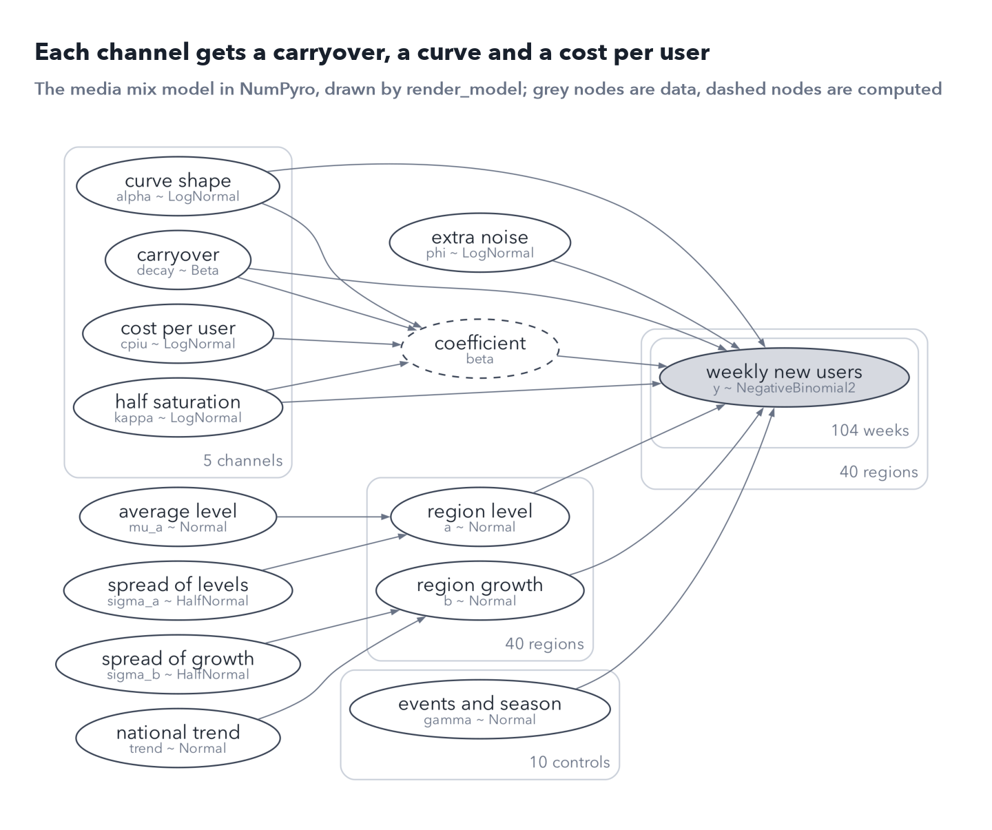
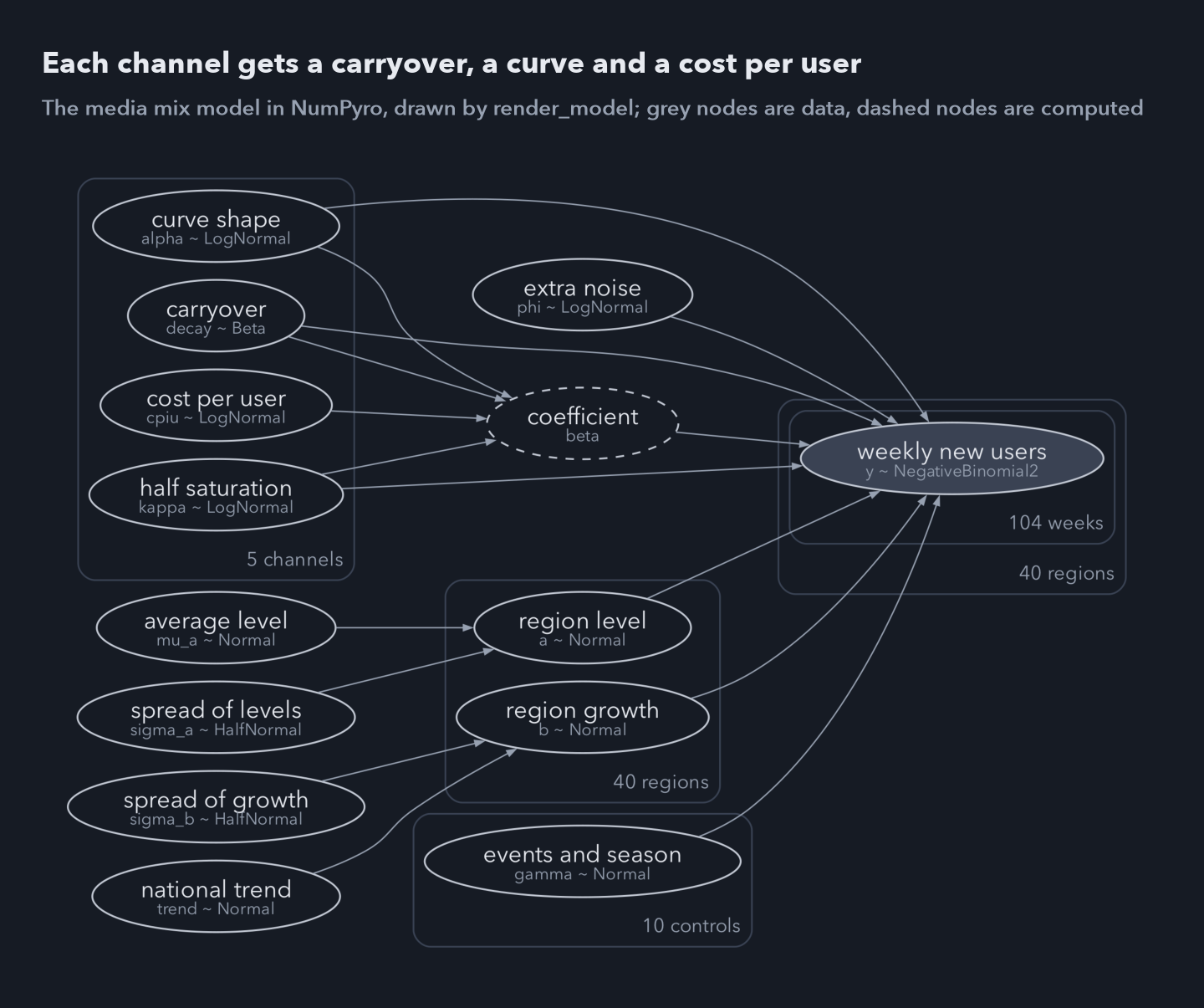 The media mix model as NumPyro’s render_model draws it, with plain names added. Grey nodes are data, dashed nodes are computed from others, and each box repeats its contents for every channel, region, control or week.
The most useful modelling choice was where to put the prior. A channel’s coefficient has no natural scale, so a prior on it is a guess. I put the prior on each channel’s average cost per incremental user instead, a number a marketer can argue with: log normal with a median of $30 and a spread of 0.8 on the log scale, wide enough to allow a channel five times cheaper or dearer. The coefficient then follows from that cost and the channel’s spend. The decays get priors by channel, short for search and longer for connected TV and out of home, and each curve’s half saturation point gets a prior centred on the channel’s typical spend. The notebook prints the whole model, about 40 lines of NumPyro.
4. Making the sampler work
In my first runs, in float32, the chains barely moved; once that was fixed, a few transitions still diverged.
Float32 is not precise enough for this model
JAX computes in float32 by default, which keeps about seven significant digits. The model’s minus log density at the starting point is 28,195, so its last digit in float32 is worth about 0.002, and it is a sum of thousands of terms, each rounded on the way. Along a short straight line through the starting point, with the smooth curve removed, the log density jitters with a standard deviation of 0.251 and by as much as 0.677. NUTS chooses points along each trajectory by their log density and tunes its step size by how well energy is conserved; errors this size swamp both, so warmup shrinks the step to compensate and the chains barely move. In float64 the jitter is zero to three decimals.
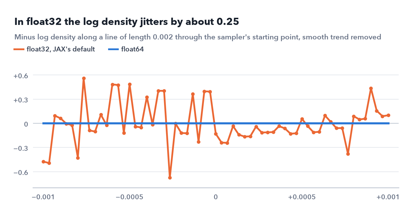
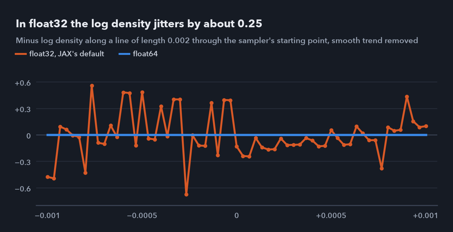 Minus log density at 61 points along a line of length 0.002 through the sampler’s starting point, after removing a quadratic trend. In float32 the jitter has a standard deviation of 0.251 and reaches 0.677; in float64 it is zero to three decimals.
The tuned step size was slightly too long
Warmup tunes the step size to a target acceptance rate, here 0.9. At that step, 13 of the 4,000 kept transitions diverged, a sign that the sampler skipped over sharp curvature, which can bias the draws. Halving the step after warmup removed them all, for about twice the work, 61 leapfrog steps per draw instead of 30, and every channel’s median cost per user moved by less than 2%. A dense mass matrix handles the strong correlations between parameters, such as between the channels’ costs and the regions’ baseline levels, and each chain starts from its own point, with the media parameters drawn from the middle of their priors, so four chains agreeing means something. The final fit has a largest Rhat of 1.004, at least 2,080 effective draws in the bulk and 1,902 in the tails, and no divergences.
Two defaults, float32 and the tuned step size, decided whether the fit could be trusted at all. Both are cheap to check: the jitter test takes seconds, and the divergence count comes free with every fit.
5. Checks before believing it
Three checks come before any result: what the priors imply on their own, whether the model recovers known costs from fake data, and whether it predicts data it hasn’t seen.
Simulated from the priors alone, marketing brings in a median 8.6% of new users, with 90% of the simulated worlds between 0.9% and 41.2%. That is wide, as it should be, and nothing in it is absurd.
I then took three worlds drawn from the priors, in which marketing brought in 20%, 5% and 10% of new users, and fitted the model to each as if it were real. 12 of the 15 true costs per user fell inside their 90% intervals, with a largest Rhat of 1.005 and no divergences. The largest miss was search in the third world, which truly cost $100.7 per user against an interval of $28.2 to $65.5.
Against the data it was fitted on, 91.2% of region weeks fall inside their 90% predictive intervals, and the national residuals show little pattern left from week to week, a lag one autocorrelation of −0.12. The stronger test hides data. Fitted on weeks 1 to 90 alone, with a largest Rhat of 1.002 and no divergences, the model forecast weeks 91 to 104, through a national flight it never saw, with an average error of 1.1%.
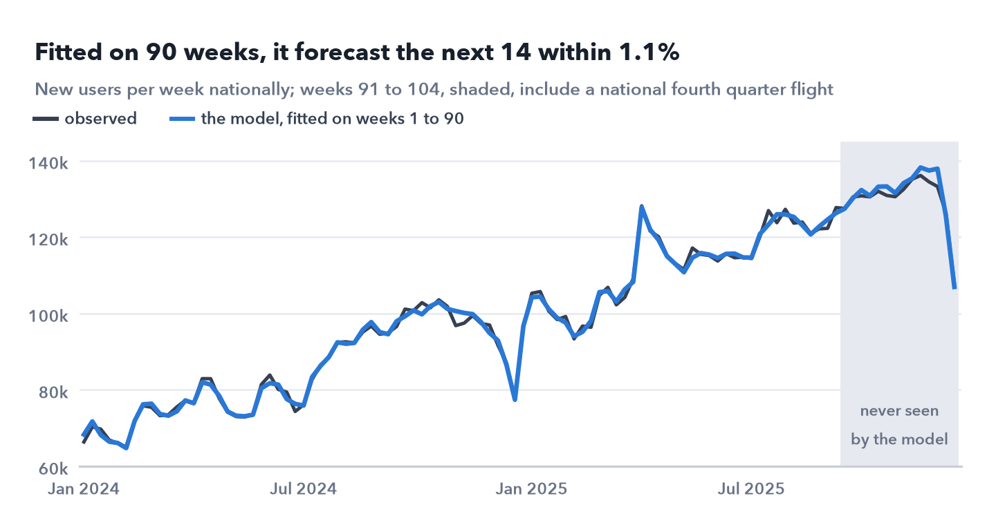
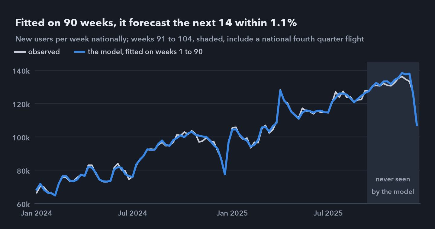 National new users per week, observed and as modelled by a fit on weeks 1 to 90 only. Over weeks 91 to 104, shaded, the forecast misses by 1.1% on average, through a national flight the fit never saw.
6. What it says about each channel
The model credits marketing with 13.0% of all new users over the two years.
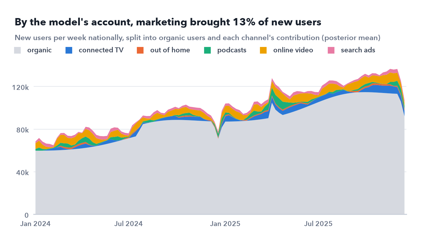
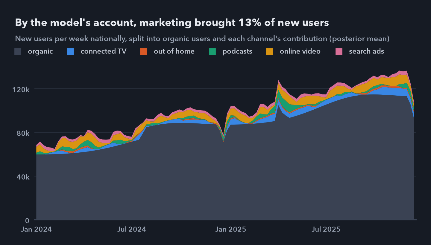 National new users per week, split into the baseline of organic users and each channel’s contribution, posterior mean. Online video is the largest channel by this account and out of home the smallest.
| Channel | Share of new users | Average cost per user | Marginal cost at typical spend |
|---|---|---|---|
| connected TV | 3.0% (2.6 to 3.5) | $26.5 ($23 to $31) | $23.0 ($19 to $28) |
| out of home | 0.7% (0.4 to 0.9) | $49.8 ($36 to $76) | $60.8 ($31 to $156) |
| podcasts | 1.9% (1.7 to 2.3) | $12.6 ($11 to $15) | $9.5 ($8 to $11) |
| online video | 5.1% (4.4 to 6.1) | $8.7 ($7 to $10) | $23.1 ($19 to $29) |
| search ads | 2.1% (1.4 to 3.4) | $13.6 ($9 to $21) | $17.6 ($12 to $30) |
Medians, with 90% intervals in brackets. The marginal cost is the price of the next user at the channel’s typical weekly spend in the weeks it runs, from $35,602 for search to $100,676 for connected TV.
The two costs can differ a lot. Video has the lowest average cost, $8.7, but its next user costs $23.1, because the model puts video’s typical spend where its curve has flattened. Podcasts are the reverse, $12.6 on average and $9.5 at the margin.
How much the data taught the model also differs by channel. On the sampler’s own scale, the posterior spread of each channel’s cost is 11% to 13% of the prior spread for connected TV, podcasts and video, but 28% for out of home and 34% for search, the two the data say least about.
7. Graded against the answer key
Average and marginal cost per new user, the answer key against the model’s median:
| Channel | Average, truth | Average, model | Marginal, truth | Marginal, model |
|---|---|---|---|---|
| connected TV | $21.2 | $26.5 | $18.7 | $23.0 |
| out of home | $30.1 | $49.8 | $40.7 | $60.8 |
| podcasts | $13.0 | $12.6 | $15.8 | $9.5 |
| online video | $11.3 | $8.7 | $51.2 | $23.1 |
| search ads | $17.3 | $13.6 | $50.1 | $17.6 |
The model gets marketing’s share about right, 13.0% against a true 12.4%, and its average costs come out in the true order, though not always the right size: the truth sits inside the 90% interval only for podcasts and search, and the largest miss is out of home, the smallest channel, at $49.8 against $30.1.
The marginal costs are where it fails. Cheapest to dearest at the margin, the truth runs podcasts, connected TV, out of home, search, video; the model runs podcasts, search, connected TV, video, out of home. The truth falls outside the model’s 90% interval for four of the five channels, and the next video user truly costs 2.2 times the model’s estimate and the next search user 2.8 times.
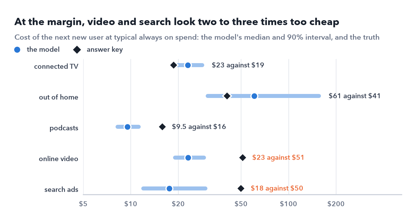
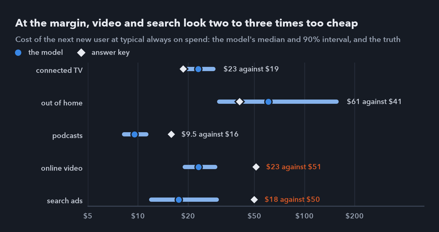 Cost of the next new user at typical always on spend: the model’s median and 90% interval, and the truth. The truth falls outside the interval for four of the five channels, and for video and search it is two to three times the model’s median.
The worst misses are the two channels the campaign never moved. A likely reason: with no regional contrast, the model can match a channel’s total contribution while getting the shape of its curve wrong, and the shape sets the marginal cost.
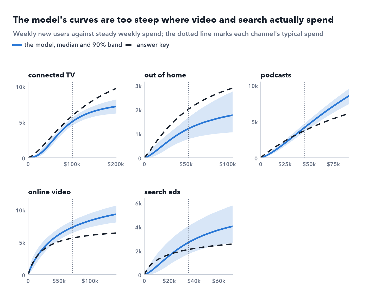
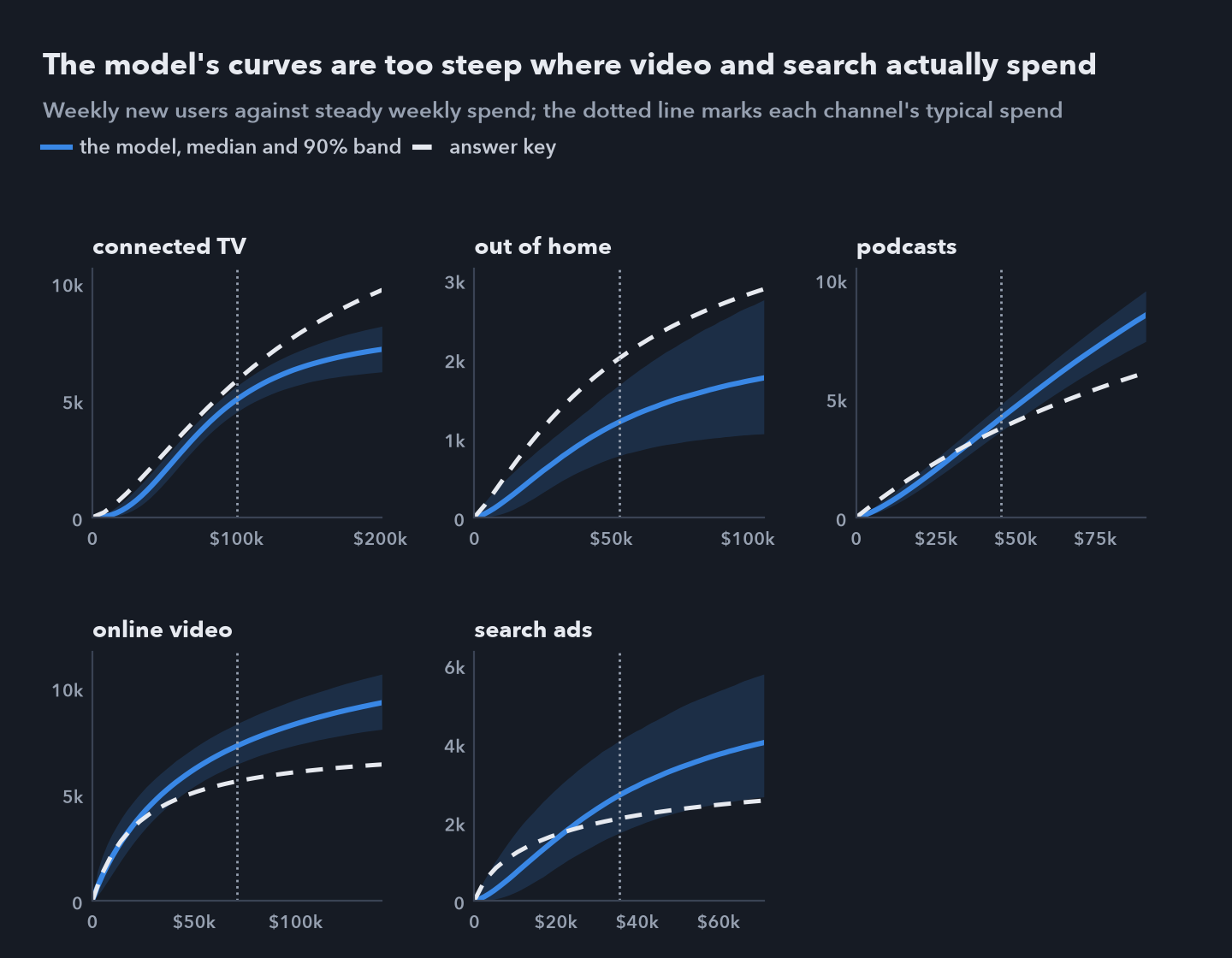 Weekly new users at steady weekly spend, the model’s median and 90% band against the answer key. At typical spend, dotted, the model’s curves for video and search are steeper than the true ones, so their next user looks cheaper than it is.
Its carryover is off too. Measured as the effect of a week’s spend in the following week against its effect in the same week, the truth is 63% for video and 5% for search, the model 43% and 53%. For connected TV and out of home, more of the true effect lands in the following week than in the same one, a shape the model’s carryover, which always peaks in the week of the spend, can’t represent. The intervals give no warning, because they describe uncertainty within the model.
One more check links back to Part 1. The model puts the launch campaign at 68,215 incremental users (90% interval 64,228 to 72,227), against 72,706 from the experiment and a true 70,475. It saw the test weeks, in which the campaign moved spend region by region. The answer key also settles the question about tags from Part 1: in year 2, search ads caused 41,264 installs, while 337,188 installs carried a search tag, 8 times as many. A search tag records the last click before an install, not what caused it.
The first thing I would change is the input. In this world every channel’s price per impression rose by 28% to 32% from 15 October to 20 December, so a dollar bought almost a quarter less advertising in the weeks of the national flight and the holidays, and a model of spend reads that as weaker returns. Modelling impressions, with spend used only for the cost, would take that confusion out.
Fit and forecast checks test the totals. They say little about each channel’s curve. Only variation between regions or from an experiment tests a curve, so moving budget on a channel bought only nationally needs an experiment first.
8. What I can and cannot say
I can say
- The model fits two years of regional data, forecasts 14 unseen weeks with an average error of 1.1% and recovers 12 of 15 known costs in fake worlds.
- It puts marketing’s share of new users at 13.0% against a true 12.4%, and ranks the five channels’ average costs in the true order.
- It puts the launch campaign at 68,215 users against a true 70,475.
- In float32 the sampler can’t work on this model; in float64, with half the tuned step, it converges cleanly.
I can’t say
- What the next dollar on video or search buys. The model prices both at a third to a half of their true cost.
- Which channel to cut or grow on this model alone. It ranks search second cheapest at the margin; the truth ranks it fourth.
- That passing the checks means the channel estimates are right. The answer key shows they need not be.
- Anything about real channels or costs. The numbers come from a simulation.
Next: The experiment and the model disagree about the campaign by about 4,500 users, and the model misprices channels the experiment never touched. Part 3 combines the two by Bayes’ rule without counting the test weeks twice, shows what the experiment can and can’t fix, and tests the budget the combined model recommends against the answer key. Back to Part 1.
Data: simulated, base scenario with seed 7. No real user data and no DuckDuckGo data; Duck.ai and DuckDuckGo are named only to set the scene. Analysis in Python with NumPyro, JAX, pandas and SciPy; the notebook for this part reproduces every result on this page. The code, the simulated data and all three notebooks are in github.com/t3chw/launch-campaign-analysis.